Five apps for one Friday night
Meaple set out to own the full journey of a Brazilian night out (before, during, and after) in a single product: discovery, social coordination, ticketing, and in-event payment. The problem nobody had solved, in Brazil, in 2020.
13
competitors mapped · none owned more than two layers
3
account tiers with hard permission boundaries
5
variables in the Momentum ranking algorithm
Current state · before this project, Brazil 2020
Nobody owned the full journey of an event. Six platforms to run one Halloween party, per one of the producers interviewed.
The problem nobody had solved
Pedro, 21, spent an entire Friday trying to find something to do: messaging during class, calling two friends after dinner, scrolling WhatsApp groups. He ended the night at home, gaming. Letícia, 26, knew there was a party that weekend, a friend had mentioned it days earlier, but the details never arrived: no location, no time, no way to find out. Fernanda, 28, organized events for a living and rebuilt the same machine every single time: a Facebook event, a Sympla listing, payment via bank deposit or PicPay, and promotion across Instagram, WhatsApp, Facebook, Snapchat, Twitter and Tumblr.
The founding team at Ensight saw the gap. Nobody owned the full journey of an event (before, during, and after) in one product. Sympla sold tickets. WhatsApp moved logistics. Facebook had the social graph but had abandoned events. Instagram had discovery but no way to act on it. PicPay moved money with no connection to what the money was for.
I joined with a blank slate: no brief, no wireframes, no prior research. My job was to define what the product should be before anyone touched a screen.
Three personas from primary research, each with a documented day-in-the-life. Different users, the same fragmentation beating all of them.
Pedro, 21
PUC student · extroverted
- Phone through class trying to plan Friday
- Calls two friends after dinner
- Ends the night home, gaming
Pain: an entire day of coordination, zero results.
Letícia, 26
Civil engineering, UFPR · introverted
- 6:30 bus, full study day
- Boyfriend asks about weekend plans
- The friend who mentioned the party never sent details
Pain: the information exists, it just never reaches her.
Fernanda, 28
Instagram influencer · event organizer
- Facebook event + Sympla listing
- Payment by deposit / PicPay
- Promo across six separate platforms
Pain: six platforms, one party.
13 products mapped across four functional layers: event discovery, social coordination, payment, and location. No single product owned more than two.
| Product | Event discovery | Social coordination | Payment | Location |
|---|
What the research revealed
I interviewed users between 19 and 30 (students and young professionals, the product's target) along with event creators and venue owners on the supply side. Three personas came out of that work, each with a documented day-in-the-life journey.
A distinction shaped everything after it: what users said, what they actually needed, and what they didn't know they needed.
What they said
- Easier event search
- More privacy filters
What they actually needed
- More precise interactions
- Better categorization
- Less friction between events, meetups, groups
What they didn't know they needed
- Event + social + chat, unified
- In-app payment
- Sub-minute small-event creation
- Precise event updates
That third column became the product thesis. Nobody asked for unification because nobody imagined it as possible. Every user had built a personal workaround system across three to six apps and accepted the friction as the cost of having a social life.
The second finding shaped the supply side: event creators had a trust and logistics problem, and discovery had little to do with it. Fernanda's six-platform routine existed because no single platform was accountable for the whole event, and an attendee buying a ticket from an unknown producer was making a blind bet: no history, no ratings, no accountability anywhere.
The business reality
Before the pandemic, the Brazilian events sector moved roughly R$250 billion/year in corporate events and R$17 billion in social events, employed about 6 million people, and represented around 4.3% of national GDP, growing about 6.5% per year (Abrafesta via G1; Abeoc/Sebrae).
Ensight set concrete targets before design started. Those numbers meant the product could not be a slow-burn social network that monetizes years later. It needed transaction revenue (ticket sales and in-event consumption) from early on. This constraint decided the central strategic question before it was even asked: which side of the marketplace to build first.
150k
Monthly active users
1.5M
Downloads
R$2.00
CAC per user
R$2.70
Revenue / user / month
17
Month horizon
The decision I almost got wrong
My first instinct was to build the consumer side first: get users in, make discovery good, then bring producers to the audience. That's wrong for a marketplace, and the business targets made it obviously wrong. A producer with no audience on a new platform has no reason to create events there. The product would die waiting for an audience that never came, all while burning acquisition budget against a R$2.00 CAC ceiling.
One producer brings their entire existing audience. One consumer brings only themselves.
The only way through was giving producers something worth migrating for before the audience existed: ticket sales, event analytics, page infrastructure, professional visibility. Revenue for producers from day one, even with a small crowd.
The research agreed after the fact
In November 2019, Lenny Rachitsky (who had led supply growth at Airbnb) published his study of the largest marketplace companies: roughly 80% grew by activating supply first (Lyft, Eventbrite, OpenTable, Thumbtack). We didn't have that study in hand when the call was made; the producer interviews took us to the same place.
The three-tier account system
Private events between friends, individual professionals, and the companies that run events: three fundamentally different cases.
What shipped: three account types with hard boundaries. The partnership model connected the tiers: a football club hosting a concert partners with the production company running the show and lists performers as professional partners. Each entity keeps its own accountability and visibility.
followers only
Personal
- Events visible only to followers
- No Explore / Momentum presence
- Transaction cap on money movement
- Creatable in under a minute
verified individual
Professional
- DJs, speakers, coaches
- Participate without owning events
- Listed as partners on company events
- Visibility without company overhead
verified organization
Company
- Unlimited ticket sales, categories, tags
- Momentum + Explore visibility
- Role management, page statistics
- Legal accountability at verification
Relations
- Personal creates Company (Facebook Pages model)
- Professional partners on Company events
- Company ↔ Company partnership, verification-gated both sides
- Only Company reaches Momentum
The same structure served webinars: one company, multiple professional speakers listed as contributors.
Momentum: the discovery engine
In 2020, distance was the only ranking signal most event apps used. A rave and a classical concert at the same distance looked equally relevant to everyone. Momentum ranked the Explore feed on five inputs instead.
Producer credibility was the variable that mattered most and cost the most to design. It combined verification status, event history, ratings on past events, and recency of activity. The goal: make bad production expensive. A new account, even verified, ranked below a producer with ten well-rated events.
What I'd do differently
The weighting between the five variables was never formally defined. The inputs were designed; their relative importance wasn't. That specification reached engineering as an open question. Today the weighting would be documented with reasoning before a developer ever saw it.
The score said cut it. We shipped it anyway.
The priority matrix scored 14 problems on importance and viability. Most decisions followed the scores: the top of the table shipped in the core MVP, and anything that needed user volume to matter (chat, video feed, real-time location) was deferred regardless of quality.
In-event consumption, the comanda (attendees order and pay inside the app), scored 1/1: lowest importance and lowest viability of all 14 rows. By the framework's logic it should never have been built. It shipped as a late MVP feature anyway, because the business model outweighed the user score. Users didn't care, and the matrix was right about that. But producers did, and the R$2.70 revenue target needed more than ticket fees. The comanda was never a user feature. It was a supply-side acquisition tool wearing a user feature's clothes.
The matrix was a tool, not a rulebook. In-event consumption scored lowest on both axes and shipped anyway: the business model overrode the score.
What this taught me
A prioritization framework measures what you tell it to measure. Ours measured user importance and build viability, with no axis for strategic value to the business model. We compensated with an undocumented override. Today I'd build the business dimension into the scoring model itself: an undocumented override looks like inconsistency to the team even when it's the right call.
Anything that needed users to work was deferred. Anything that made producers money shipped, even, once, against the matrix.
Shipped
Onboarding & account
Core
Deferred
Needs user / content volume
Four months from zero to MVP scope, documented before the first screen.
- splash
- login
- account creation
- password recovery
- profile config
- categories + tags
- signup helper
- profile page
- business activation
- business page
- social feed
- event history
- notifications
- branding
- Rolê
- Vaquinha (group pool)
- payment definition
- Chega aí
- auto events
- interaction methods
Designing for the worst moment
Someone in a loud venue, holding a drink, one hand, getting interrupted: possibly stressed, possibly not fully literate in the moment, possibly with a physical impairment. Discovery mapped five context states, and they all pointed at the same user.
Physical
One hand, possibly left, in motion, doing something else simultaneously.
Environmental
Loud venues, frequent interruption, walking.
Preferential
Visual over text, no audio dependency, minimal steps.
Emotional
High stress possible, payment or friend-finding urgency, low tolerance for friction.
Cognitive
Digitally native but distracted; clarity for all education levels.
The constraints that came out of that: content visual over textual (the target won't read paragraphs in a nightclub), audio banned as an information channel entirely, every primary action within one-hand reach, interfaces recoverable from any wrong tap in one action.
What I'd do differently
The ergonomics held up: one-handed use, visual-first content, interruption recovery. Formal accessibility didn't. The design answered "may have physical impairments" with good instincts instead of a standard: no WCAG audit, no contrast verification, no screen reader consideration. An event app lives in dark rooms with flashing lights on mid-range screens, which makes accessibility more critical there, not less. Today every core screen would pass WCAG 2.1 AA before handoff.
Navigation weight followed documented priority, not opinion, mapped onto the business value chain.
What I'd build differently
Connect targets to decisions, explicitly
The targets shaped the big calls (supply-first, the comanda override), but the connection lived in conversation, not documents. No decision record traced "we're building X because target Y demands it." When scope pressure came, the reasoning existed only in memory.
Design the partnership failure states
The happy path was designed. Nobody designed the disagreement: one partner cancels, the other refuses, then what? Revenue split when both sell tickets? Partnership status when one entity loses verification? These are the moments that decide whether users trust the platform.
Make the matrix a signed team artifact
The cuts were correct; the process lived in my head. The team never treated the matrix as the shared contract for scope, so "should we add chat back?" was always one persuasive argument away from reopening. A signed artifact answers with criteria instead.
This was also the project where I worked as the only designer, reporting directly to the two co-founders and working daily with two engineers translating specs into product. That ratio, one designer to a small founding team, is what pushed me toward handoffs detailed enough to build from without a follow-up conversation.
Product & identity, built in Curitiba
Identity built alongside the product, not applied after: "uma plataforma social completa focada em eventos de todos os tipos e tamanhos."
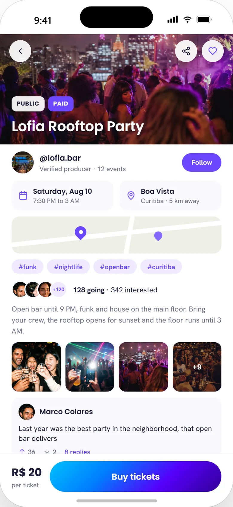
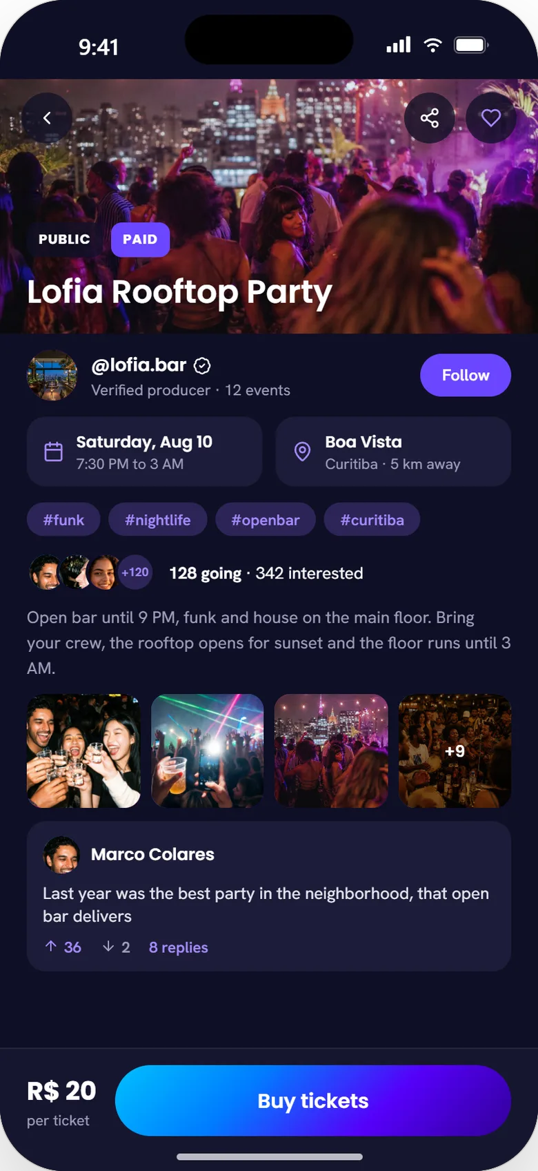
Event page, the flagship. Every field from the spec in one scroll: producer identity and event history with a one-tap Follow (the trust chain from §05), date and location with a spatial mini-map (the same layer Momentum ranks on), tags plus a going/interested count and a recent-turnout photo strip feeding producer credibility back into Momentum, and an in-app buy bar pinned to one-hand reach, the supply-side revenue that justified building producers first.
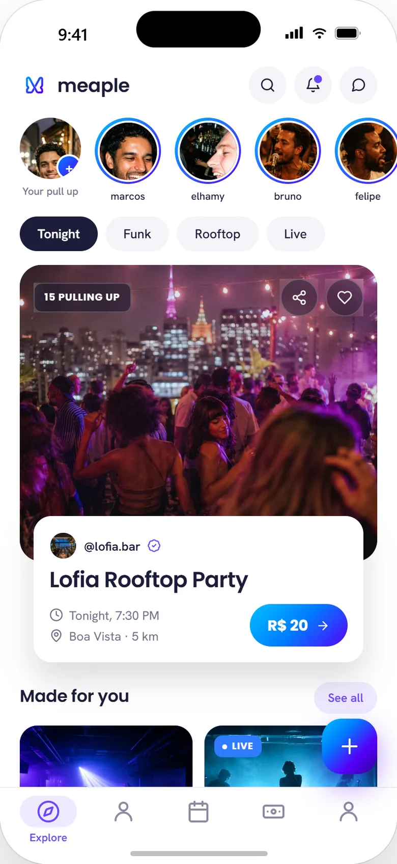
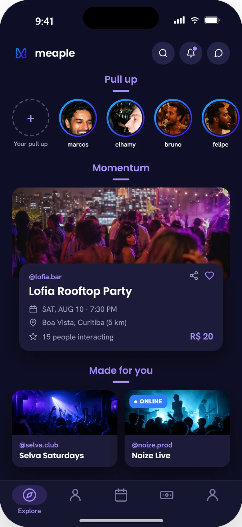
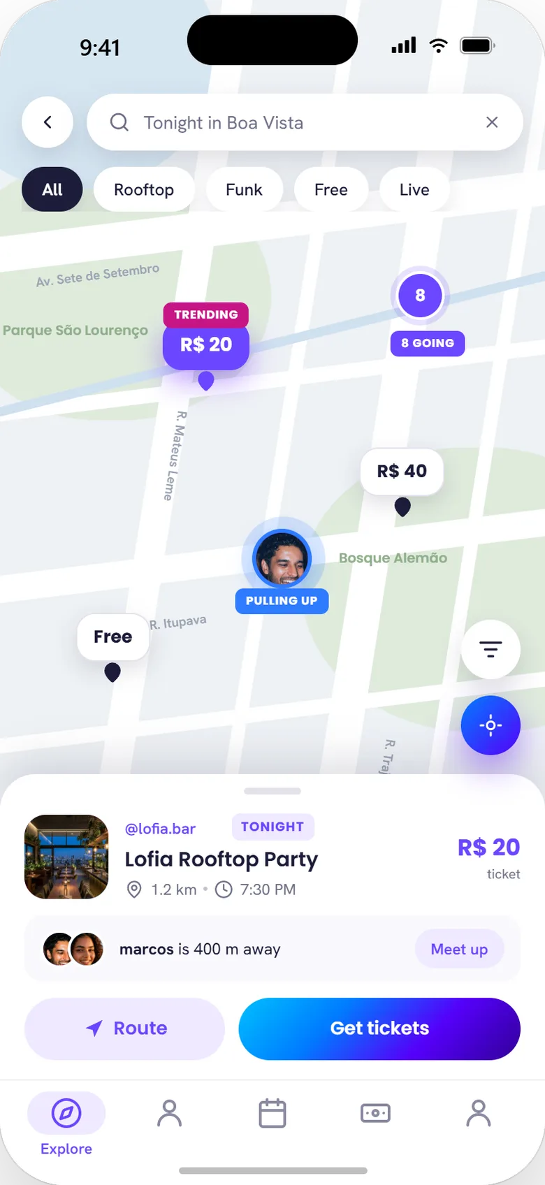
Explore / Momentum. A "pulling up" story row surfaces friends already heading out; mood filters (Tonight, Funk, Rooftop, Live) narrow the ranked feed underneath; the featured Momentum card carries a live headcount, "15 pulling up," as social proof stacked on top of the algorithm. On the map, pin size still renders interaction volume in space, a trending event gets its own badge, and a friend converging on the same pin surfaces a one-tap Meet up, closing the loop between discovery and the group actually going.
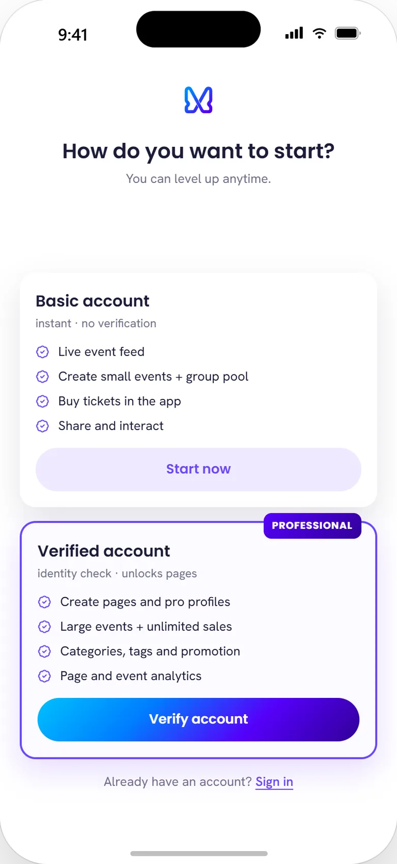
Onboarding fork. Two doors, two commitments. Basic signup gets a live product in seconds; verification unlocks the commercial stack: pages, unlimited sales, categories, analytics. No one is blocked at the door, and the people who bring events have a clear reason to verify: the supply-first bet, encoded in a screen.
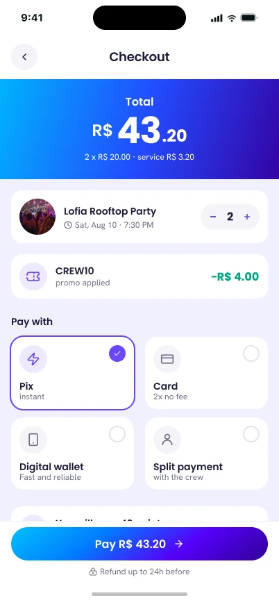
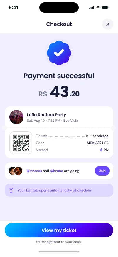
Checkout, then a QR code you can already use. Pix, card, or split with the crew; loyalty points tick up before the tap; confirmation hands back a scannable ticket in the same screen instead of sending users to go find it. That ticket is one of four tabs in a single event hub, Ticket, Orders, Tab, and Feed for the event's live photo stream, which replaced a flat "Wallet" destination in the main nav; the tab bar itself is now labeled Events. The bar tab named on the confirmation screen opens automatically at check-in, so the comanda below is already running before the QR gets scanned at the door.
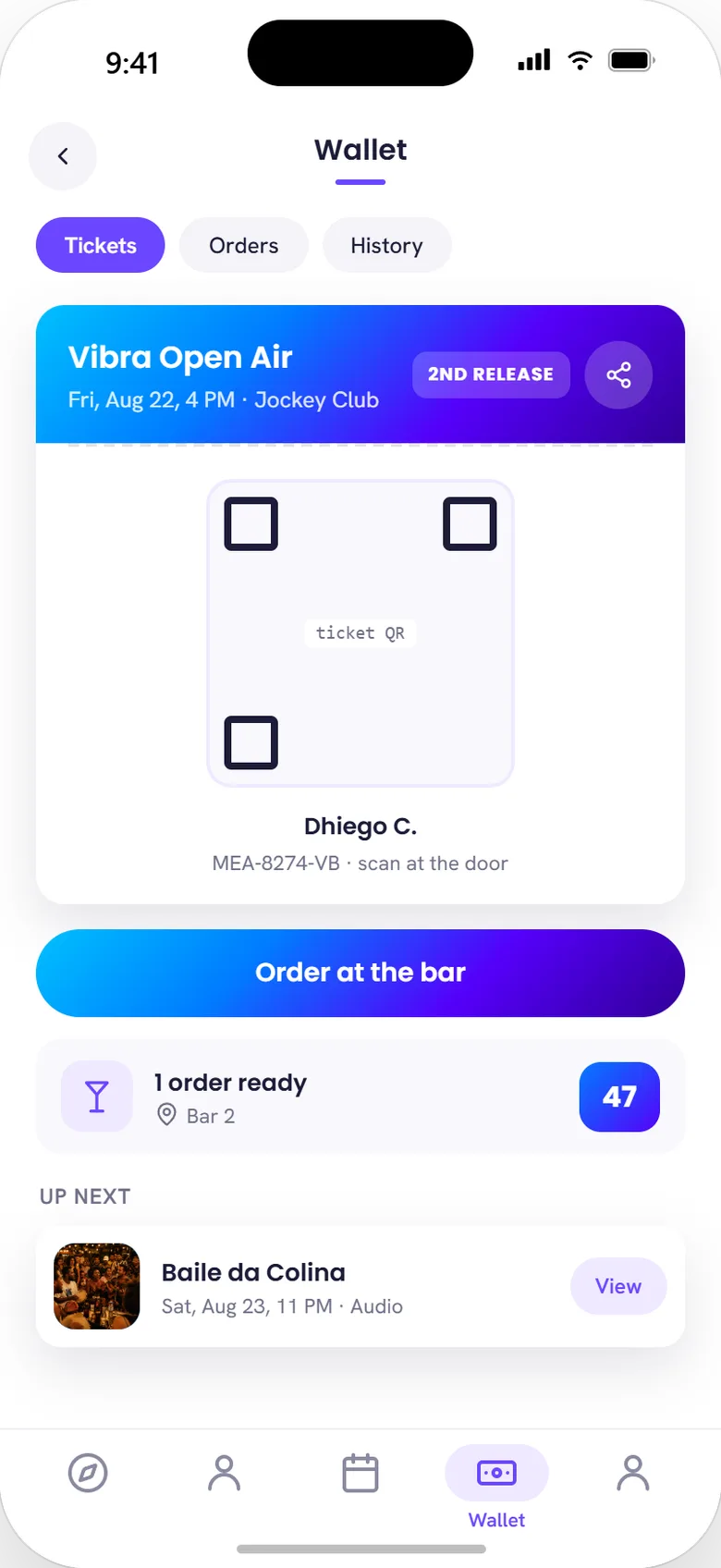
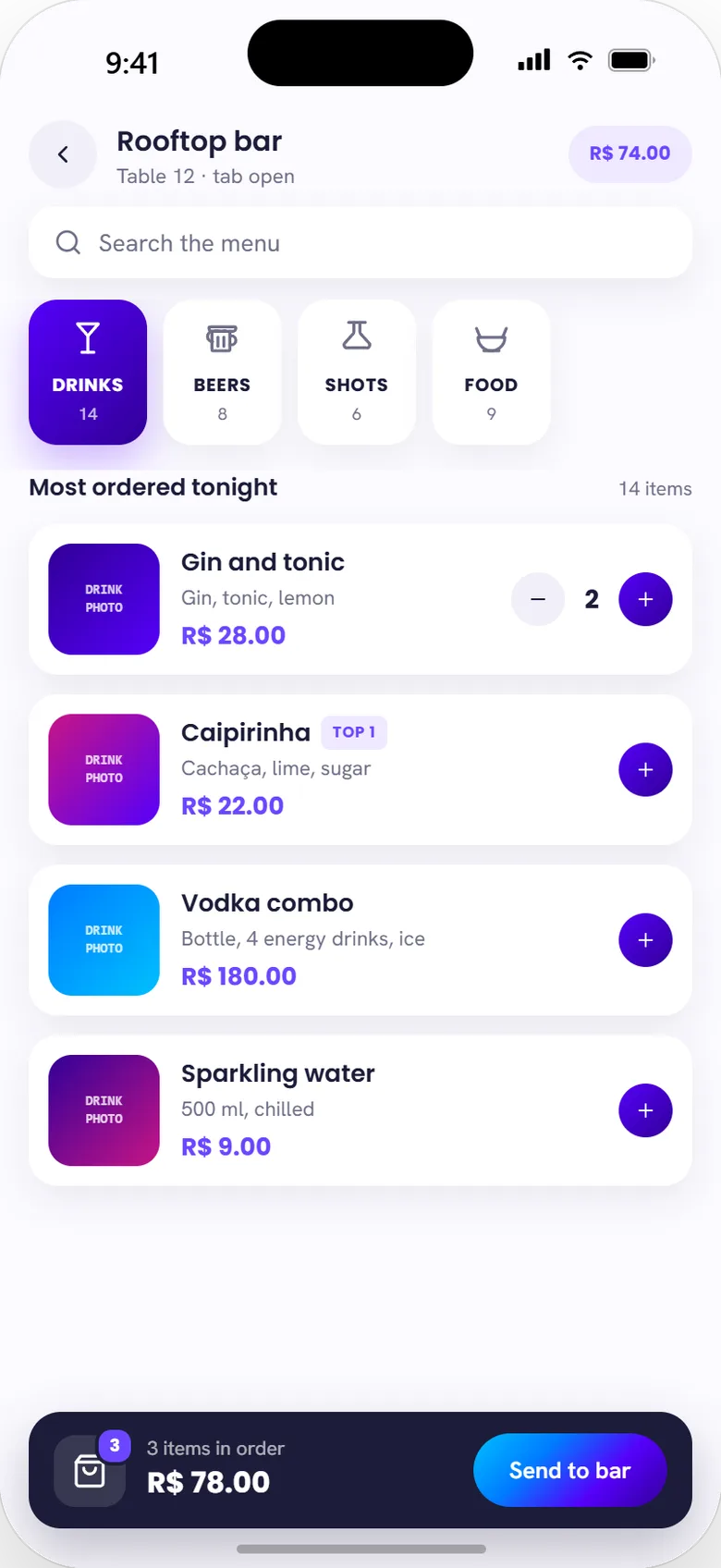
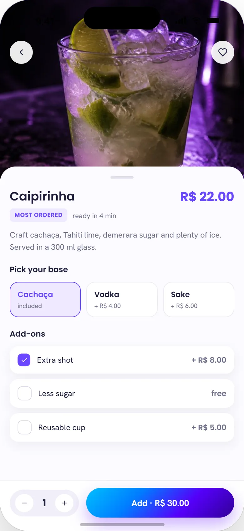
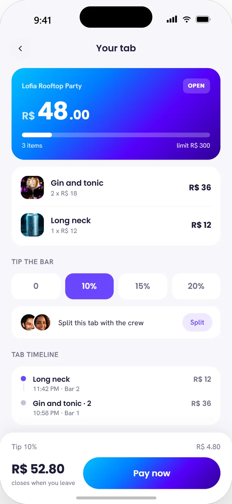
Comanda: order and pay inside the event. Orders and Tab are two more tabs in that same event hub. The menu adds a search bar, category counts, and a "most ordered tonight" list for social proof on top of the one-tap add; picking an item opens base-spirit and add-on choices before it lands on the bill. The open tab itself shows a running total against a spending limit, a tip selector, a one-tap split with the crew, and a timeline of what got ordered when. Consumption accrues to a bill the producer can capture instead of losing it to cash and card machines. This is the 1/1 feature from §07: scored lowest on the matrix by users who didn't care, shipped anyway because producers did.
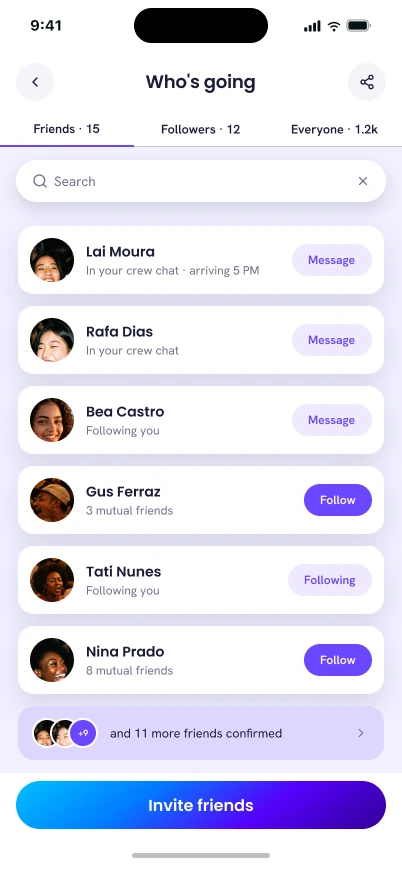
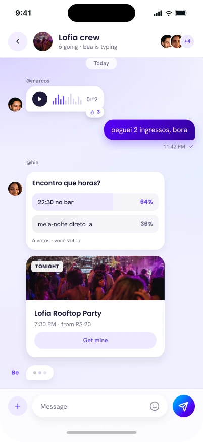
Who's going, and the chat that gets you there. Search plus three tabs, Friends, Followers, Everyone, turn a static guest list into a way to find people already confirmed instead of scrolling past a thousand strangers: a direct answer to Letícia's problem from §01, the information existed, it just never reached her. Chat carries that further into the thread itself: voice notes, a live poll for "what time are we meeting," and a shared event card with a buy button, so the group can go from "should we go?" to holding a ticket without leaving the conversation.
 meaple
 meaple
 meaple
Primary
Secondary
The mark reads as an "M" and a butterfly at once. The gradient runs cyan → blue → violet → deep purple: a blue-forward system, not the "violet/purple" the old brand doc called it.
The full app
25 screens, one design system
Every core flow, designed end-to-end: discovery, the social graph, transactions and the comanda, plus the producer side. Tap any screen to enlarge.
The product paused because of a global pandemic. The design was working.
Meaple shipped its MVP and was in active use when COVID-19 made public gatherings illegal and the market it was built for stopped existing: 350,000 events canceled in Brazil in 2020, 98% of the sector hit, R$230 billion lost across 2020–2021 (Sebrae; Abrape). Development paused. Meaple is live today at meaple.com.br, running real events from real producers, including national acts.
The product paused because of a global pandemic. The design was working.
Sources: Abrafesta via G1 (2020): pre-pandemic sector size and employment · Abeoc/Sebrae (2019): GDP share and growth rate · Lenny Rachitsky, "How to Kickstart and Scale a Marketplace Business" (Nov 2019): supply-first finding · Sebrae/Abrape (2020–2021): pandemic impact · Primary research: user and producer interviews, Ensight (2020).
Let's talk
Open to the next role.
Let's talk.