The product had credibility. The website didn't.
Selo H is Brazil's first workplace mental health certification built to international standards, grounded in NR-01, Lei 14.831/24, WHO guidelines, and ICD-11. Companies including Alelo, Amil, Arcor, Claro, and Cogna had already been certified. None of that credibility showed on the website. When the old domain lapsed at GoDaddy, I had one week to rebuild it from scratch.

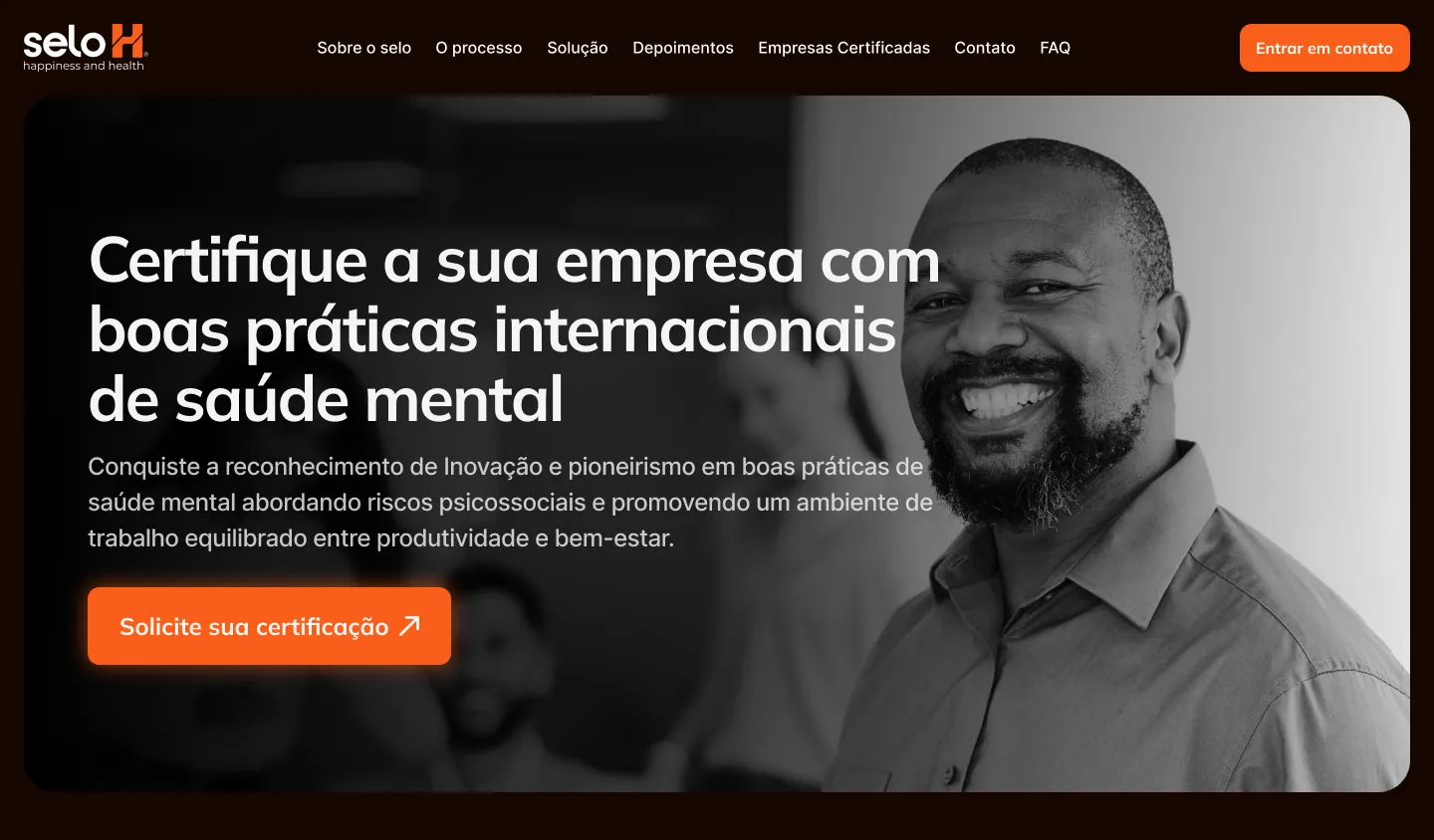
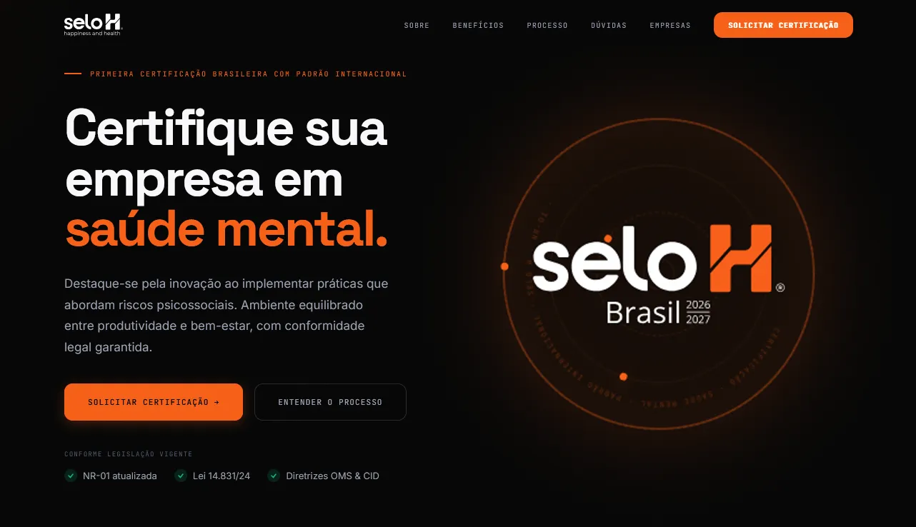
Before and after · same certification, a site that finally proves it
The situation
Selo H is the first Brazilian workplace mental health certification built to international standards. It is grounded in NR-01, Lei 14.831/24, WHO guidelines, and ICD-11. Companies including Alelo, Amil, Arcor, Claro, and Cogna had already been certified. The product had real credibility and real demand.
The website wasn't showing any of it.
The old domain had lapsed at GoDaddy. Renewal costs had reached R$800. The client needed a new site built from scratch in one week, not for polish, but because the certification process itself runs through the website. Without it, there was no channel to generate leads or document new client certifications.
The brief was precise: make the site as serious as the certification itself.
The diagnosis
Before writing a single line of copy or opening a design file, I audited what was there. Six problems compounded each other.
No clear primary action. Multiple competing CTAs diluted intent, and there was no single, decisive path to a certification request. The information hierarchy was inverted: legal compliance proof, the certified-company list, and the 4-step process were buried or sequenced after less persuasive content, when they were the strongest reasons to act.
The copy described the certification instead of making the case for it. No urgency. No cost of inaction. No proof any of this was real. Performance worked against trust: LCP sat around 4.8 seconds on a compliance product where the first impression is the entire pitch. Alelo, Amil, Arcor, Claro, and Cogna were listed as certified companies, not featured. Present, but easy to miss. The visual language was inconsistent, generic, and gave the product no personality of its own.
One question shaped every decision that followed: what does a compliance-minded HR director need to believe before requesting a certification? That answer set the section order, the proof architecture, and the copy tone.
Lead with the outcome, not the product
HR and legal decision-makers don't arrive at a certification site looking for features. They come looking for permission to act: proof that this is real, selective, and worth the internal process of getting it approved.
Old framing
The hero opened with what the product was: a workplace mental health certification. It asked the visitor to care before giving them a reason to. Decision-makers had to read far enough to find what the certification would actually do for them.
New framing
The hero opens with what the reader already wants: proof that the company takes mental health seriously. The certification is the path. The outcome (legal compliance, an employee wellbeing signal, reputational credibility) is what the buyer is actually after.
Leading with the product asks the visitor to care before they have a reason to. Leading with the outcome meets them where they already are. The headline ("Certifique sua empresa em saúde mental") is the buyer's goal, not a product description.
Compliance proof above the fold
For an HR or legal decision-maker, NR-01, Lei 14.831/24, WHO guidelines, and ICD-11 aren't footnotes. They are the primary reason to move forward. On the old site, they were buried.
Fine print
Legal references appeared deep in the page, after copy and visuals that didn't address compliance at all. A cautious buyer who needed legal grounding had to scroll to find the thing they came to confirm.
Credibility anchors
NR-01, Lei 14.831/24, WHO guidelines, and ICD-11 appear immediately beneath the headline, visible in the first scroll without any action required. They function as anchors, not fine print.
In compliance-driven markets, the website is part of the pitch. If the legal foundation isn't immediately visible, cautious buyers self-disqualify before reading anything else.
Rigor as proof, not barrier
A rigorous 4-step certification process can read as bureaucratic and intimidating, or it can read as purposeful and valuable. The old site read as the former.
What the old process said
Each step listed what would happen. No explanation of why each step existed or what it protected the company from. A 4-step process without a reason feels like overhead, not value.
What the new process says
Each step states its specific purpose: why it matters and what it delivers. The rigor becomes proof of quality instead of a barrier to entry.
The buyer's real objection isn't whether the certification is legitimate. It's whether it's worth the internal effort. Showing that every step exists for a reason answers that directly.
Social proof at the close
Alelo, Amil, Arcor, Claro, and Cogna are the strongest signals that the certification is real and selective. On the old site, they appeared too early, before a visitor had enough context to understand what they meant.
Proof too early
Company logos appeared near the top of the page, before the visitor understood the certification, the process, or the legal grounding. Listed, not featured. Easy to scroll past without registering what they represented.
Proof at the decision point
Certified companies now appear directly before the contact form: the last thing a prospect sees before deciding whether to act. A dedicated certified-companies page was also built as a searchable proof directory.
Social proof works hardest at the moment of decision, not as an introductory claim. Moving the company list last turns it into a closing argument.
One CTA, present throughout
The old site offered multiple paths: newsletter, downloads, alternate contacts. Each one fragmented intent and gave undecided visitors an easy way out.
Multiple paths
Competing CTAs across the page. A visitor who wasn't sure what to do had several places to go, none of them toward a certification request. Optionality scattered the intent the page was supposed to build.
One path
"Solicitar certificação" is the only ask on the page, repeated consistently from hero to footer. No alternate paths. Every section points toward one decision.
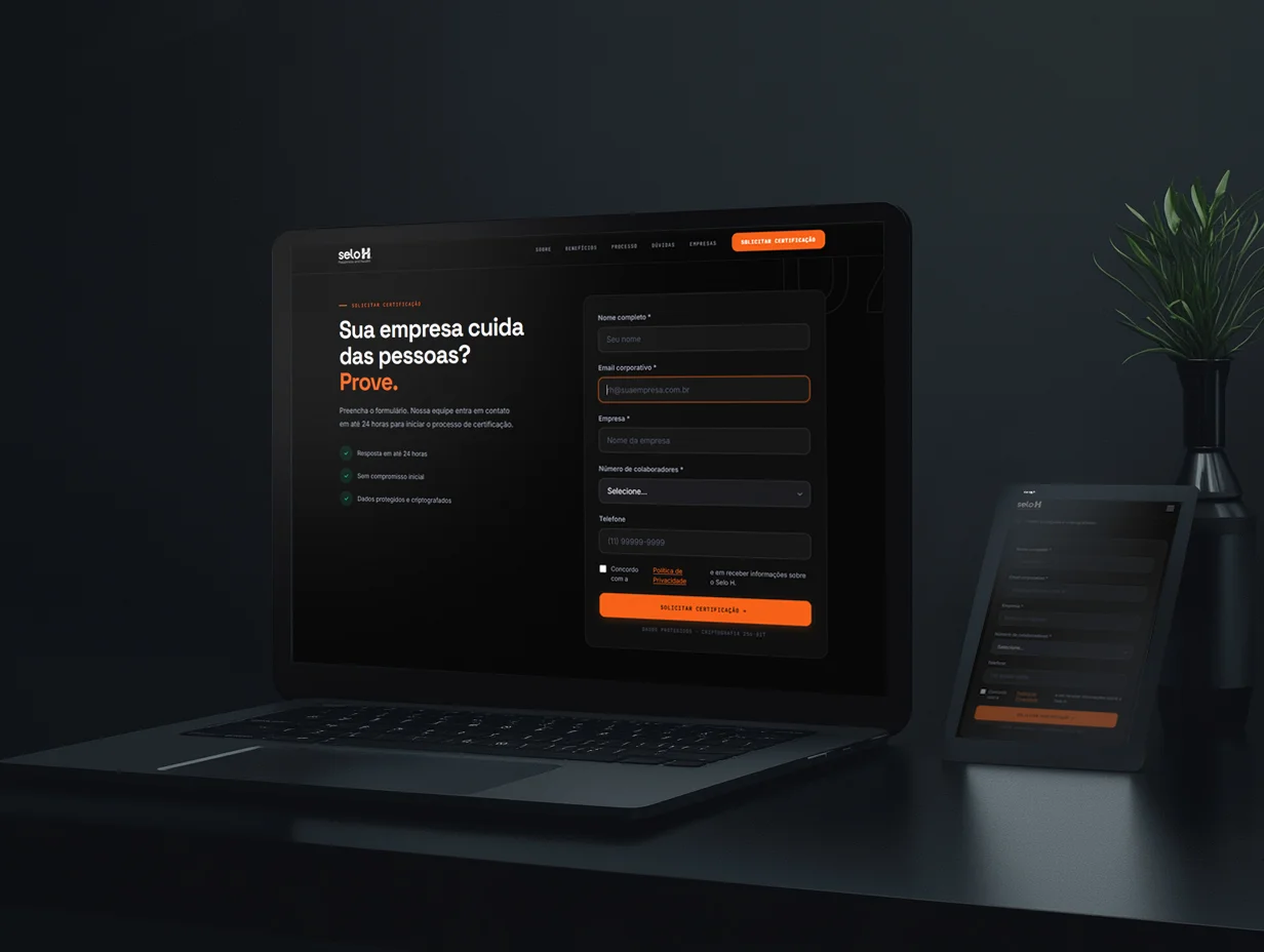
In a high-consideration purchase, optionality is the enemy of conversion. A visitor who sees the same clear action at every scroll position knows exactly what they're deciding.
Performance from scratch
An LCP of 4.8 seconds on a compliance-focused product undermines trust before a single word gets read. In a market where credibility is everything, a slow site contradicts the product.
Template approach
The previous site ran on a generic template with third-party CSS/JS overhead, blocking scripts, and no control over load order. Performance problems were baked into the architecture, not incidental to it.
Clean rebuild
Full clean HTML/CSS build. No unnecessary frameworks, optimized asset delivery, WebP images, semantic HTML throughout. Full control over what loads, when, and in what order. LCP: 1.4s. Lighthouse: 100.
Performance isn't a technical metric here. It's a first impression. A certification platform that loads in 1.4 seconds signals the same rigor it certifies for.
Results
Everything below was measured in the first 30 days after launch. No paid ads. No outreach campaign. The site alone.
3×
More leads in the first month vs. pre-launch baseline
30-day post-launch measurement
-40%
Bounce rate vs. pre-launch baseline
30-day post-launch measurement
+65%
Form submissions per month (certification requests)
Monthly comparison, post-launch
1.4s
LCP, down from 4.8s on the original site
Core Web Vitals measurement
2.3×
Increase in time on page
30-day post-launch measurement
100
Lighthouse score
Lighthouse audit post-launch
What changed that isn't a number: the client went from a site that contradicted the credibility of its own product, to one where the visual language and the certification's authority are aligned. A compliance buyer who lands on the site now sees legal rigor, recognizable certified companies, and a clear path forward, in that order, in the first scroll.
Reflections
Urgency produces clarity that comfortable timelines don't. One week with a real deadline forced the same prioritization Fiter's two-week constraint did. I identified what mattered most, built that first, and cut the rest. I'd take the tight timeline again.
Compliance products are sold on proof, not features. NR-01, Lei 14.831/24, WHO guidelines, and ICD-11 did more conversion work than any layout decision I made. Surfacing legal grounding immediately is now a standing rule for any compliance-adjacent project I take on.
Real client logos are wasted if they're not felt. Alelo, Amil, Arcor, Claro, and Cogna were already on the old site. Moving them to the decision point turned a listed detail into a closing argument. The fix was placement, not content.
What I'd do next: GA4 event tracking per section to identify exactly where the certification request decision gets made, a blog targeting NR-01 and mental health workplace compliance queries (low competition, direct commercial intent), an A/B test of the hero headline against an urgency-led deadline-framing variant, and an expanded certified-companies page with filters by industry and company size.
A one-week deadline only holds if design and build move at the same time, not in sequence. Afonso implemented and hosted the rebuild while I was still finishing later sections. That overlap is the only reason this shipped in seven days.
Let's talk
Got a project?
Let's make it work.