Onboarding as a product surface
Financial products need to collect sensitive information before users see any value. That makes the first steps of the experience the most fragile part of the flow. Long forms, unclear requirements, and forced account creation gates can kill activation before signup completes.
0
forced account creation gates · guest-first with progressive disclosure
1
question per screen · account type committed before any form field appears
6
steps visible from screen one · persistent stepper eliminates uncertainty
Current state · standard fintech onboarding
The onboarding experience is where regulatory requirements and user momentum collide. Treating it as a technical handoff misses that every friction point in this flow is a design decision.
The concept
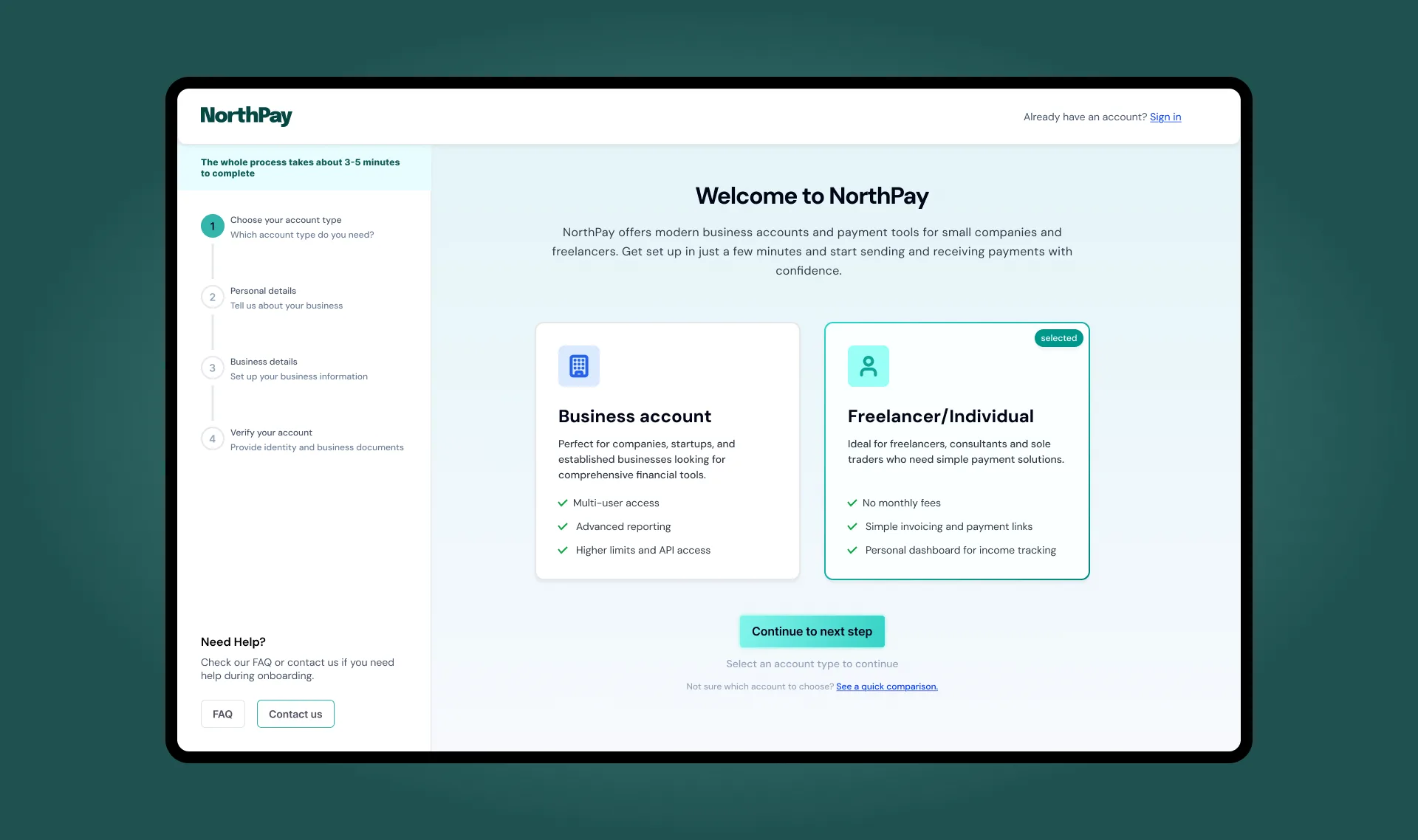
NorthPay is a concept fintech onboarding flow, from account type selection through KYC verification and first-use setup.
Every field in an onboarding form sits between the user and the product. The sequence those fields appear in is a design decision, not a compliance requirement.
Onboarding is the point where first impressions, regulatory constraints, and conversion rates converge on the same sequence of screens.
Problem & context
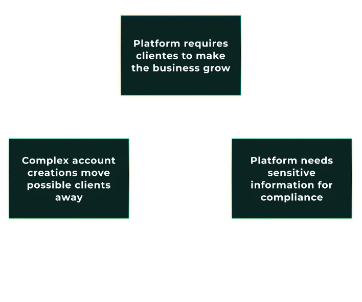
Financial products must collect sensitive information before users see any value. That makes onboarding the most fragile part of the flow. People are creating an account, sharing personal details, and waiting on verification without knowing yet whether any of it is worth their time.
User
Why is this so long?
Too many fields at once, no indication of how many steps remain, no visible reason to trust the product asking for sensitive data.
Business
Where are they dropping?
Account creation before any product value is seen is the single highest drop-off point in onboarding. KYC adds another layer on top of that.
Compliance
We need all of it
Every field that feels excessive to the user is there because regulation requires it; the fix is in how it's presented.
Long forms, unclear requirements, and weak feedback stall activation before the product is even used. Every field in the sequence is required by regulation. How that sequence is presented is a design decision.
Design challenge
The challenge was structural: how to collect everything compliance requires while keeping users oriented at every step. A visible endpoint and a fixed question-per-screen pattern address both.
Standard approach
Show everything upfront. All fields on one screen, all steps implied. The user doesn't know how long this takes until they're already deep in it. That's when they quit.
NorthPay approach
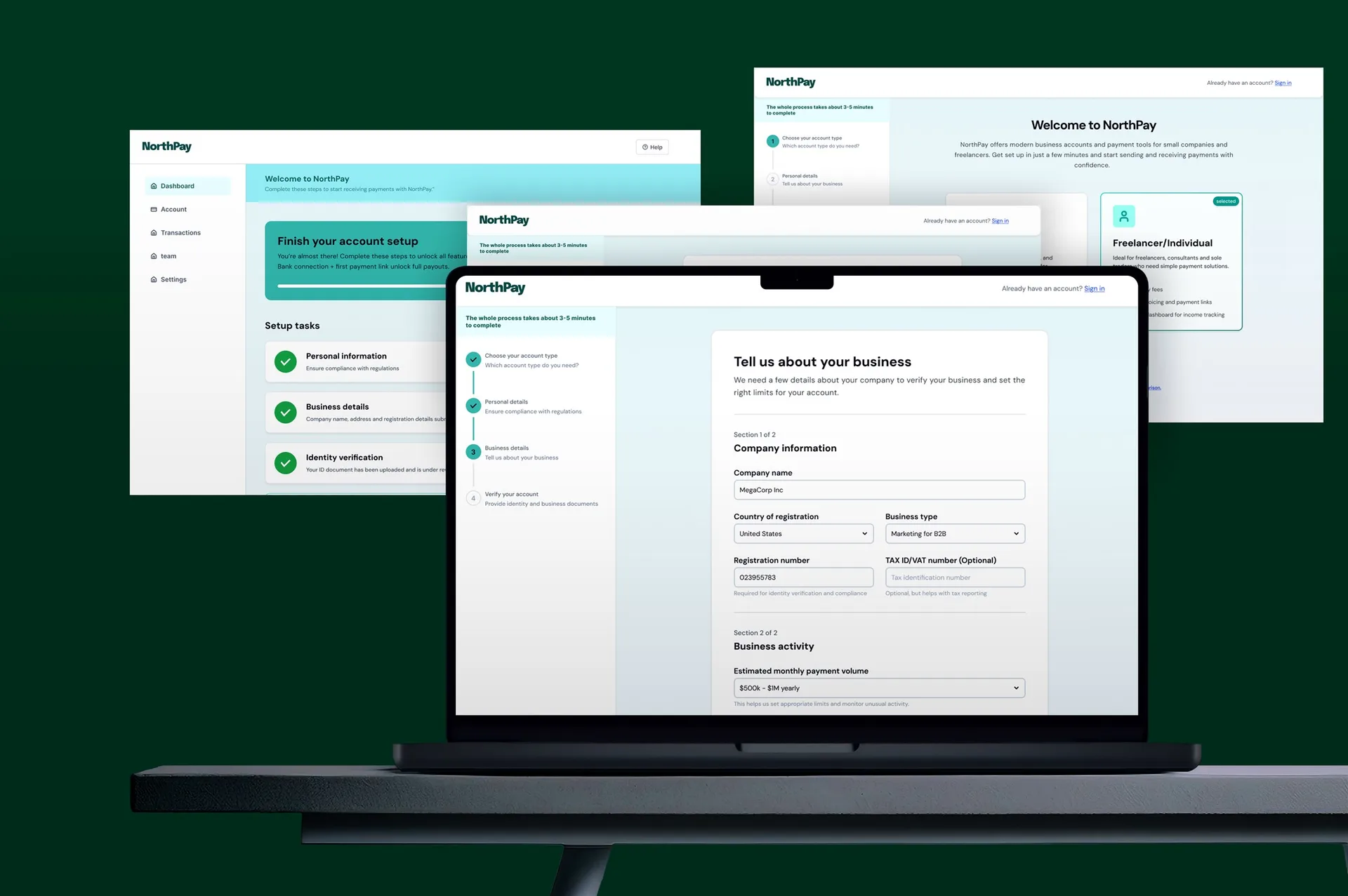
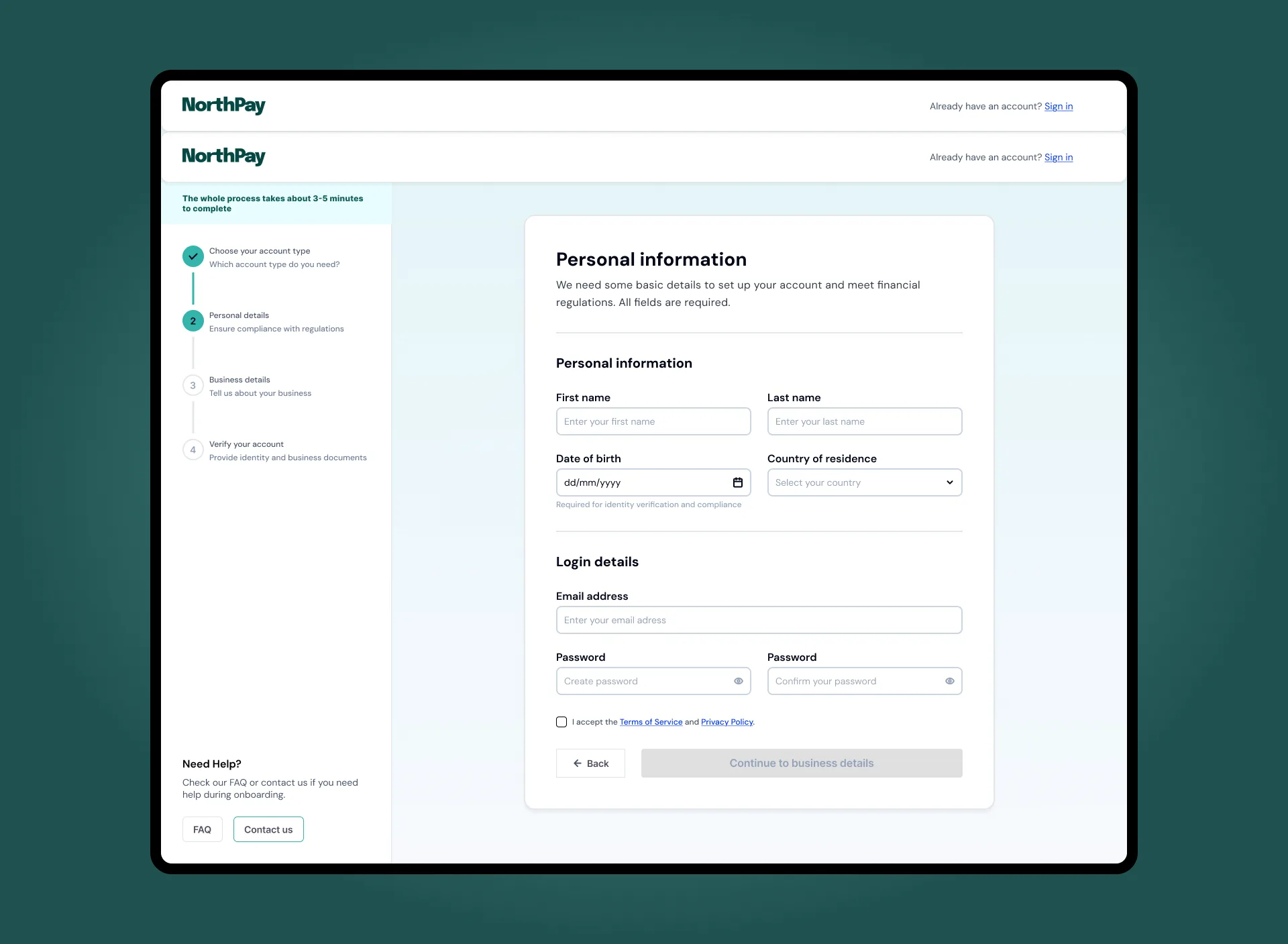
One question at a time. Visible step count from the first screen. Account type selected before any form opens. Each next step is earned by completing the current one.
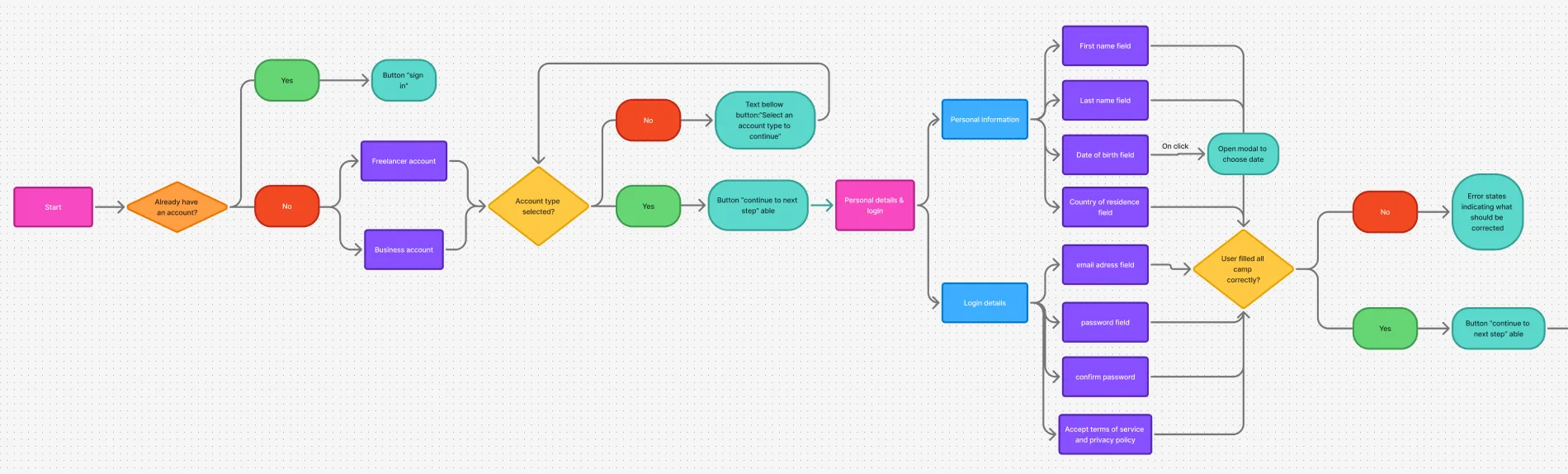
IA & user flow
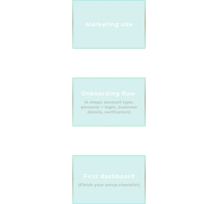
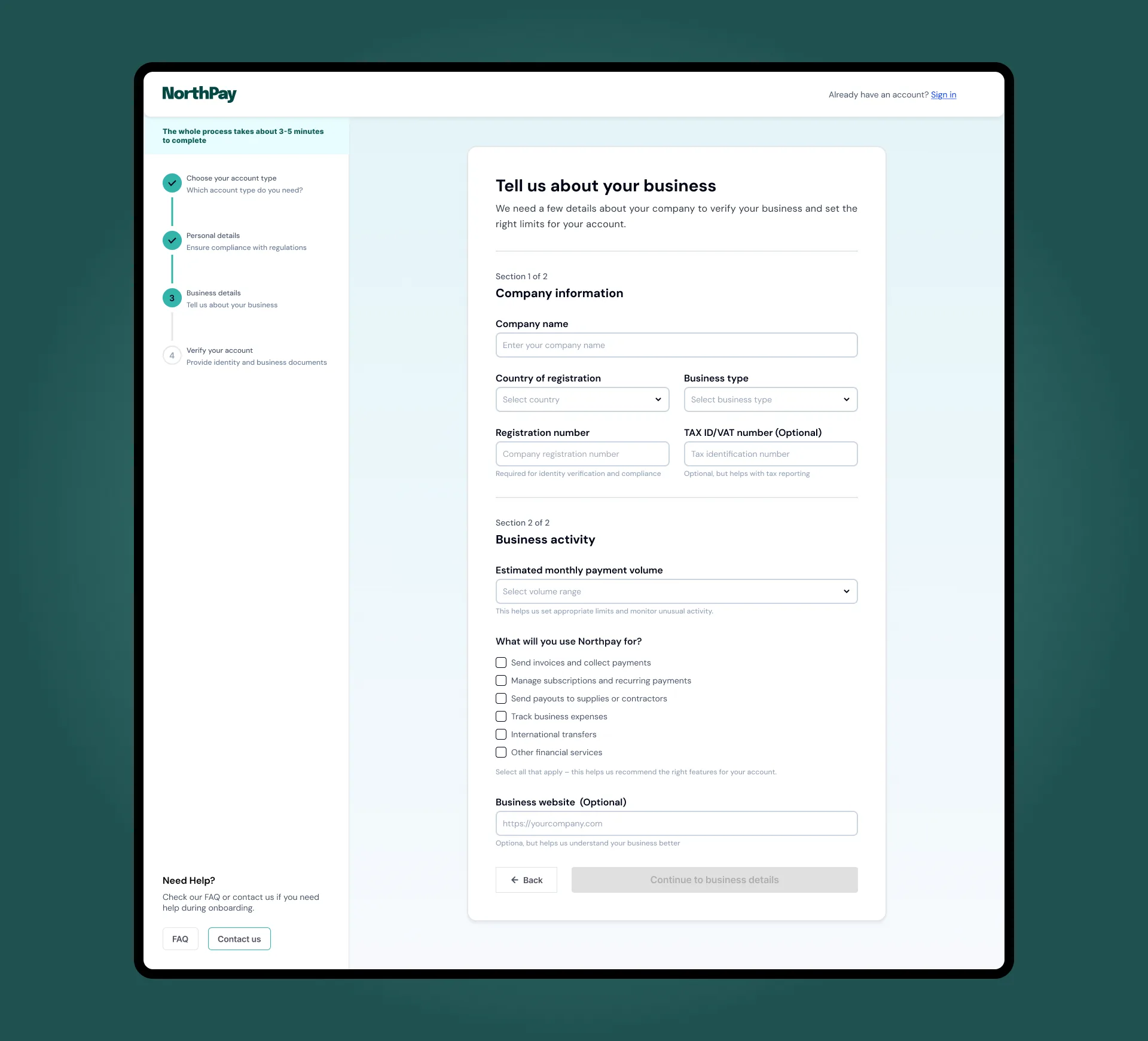
The onboarding experience is split into a public entry point and a gated product flow. Within the product, a simple sequence guides users from account type to verification, with clear branching for personal vs. business accounts.
Account type is the first decision. Every field that follows depends on it. Making it the first screen removes the worst failure mode: mid-form type switching that wipes all entered data.
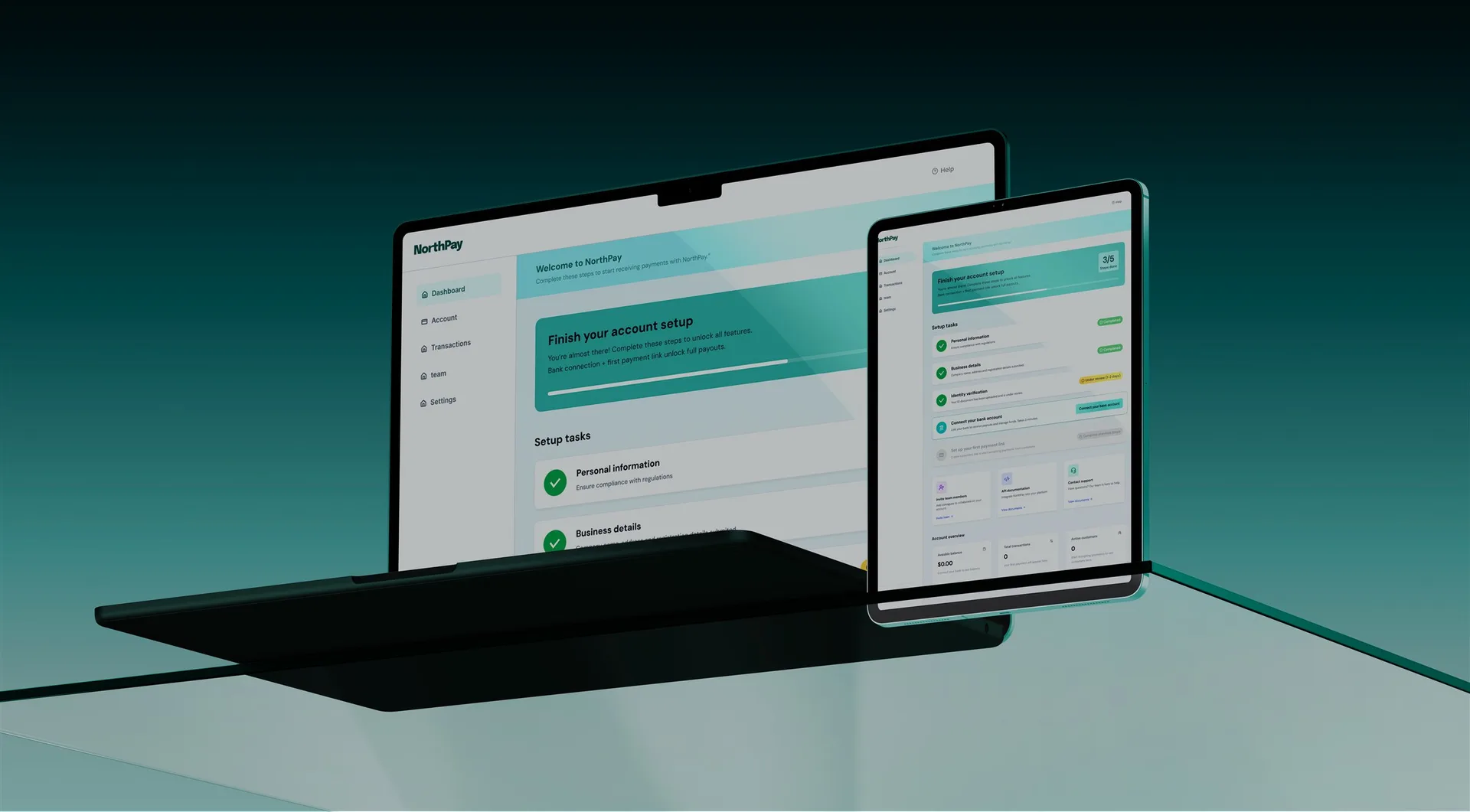
The flow is three phases: account selection, identity collection, and verification. All three are visible in the stepper from step one, so no phase is a surprise when it opens.
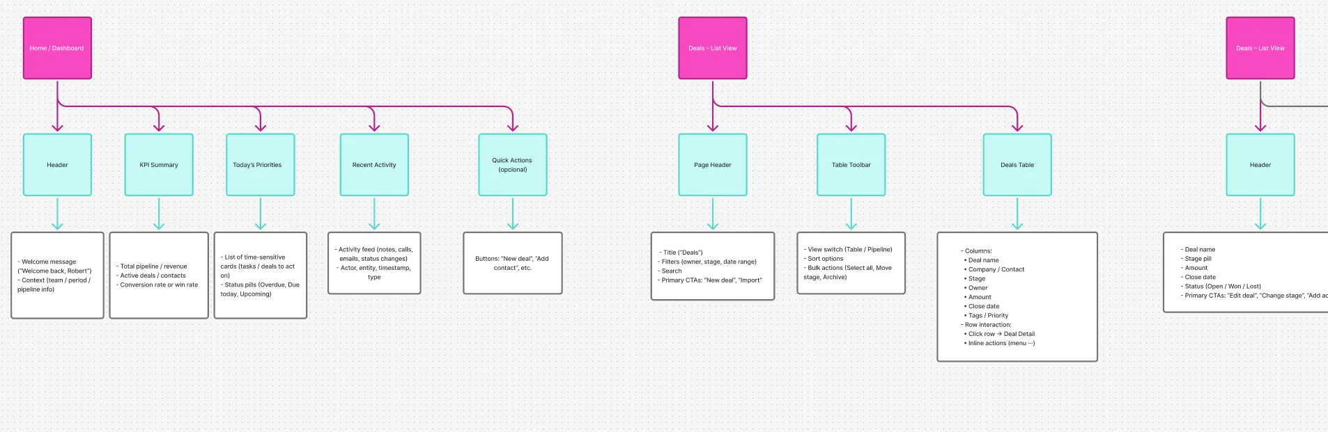
Wireframes & UX decisions
Low-fidelity wireframes locked in structure and sequence before visual decisions were made. A persistent stepper shows users where they are and what remains. Grouped fields keep each screen focused on a single step.
One question per screen is slower to build and faster to complete. The perceived complexity drops when each screen has one job and makes it obvious.
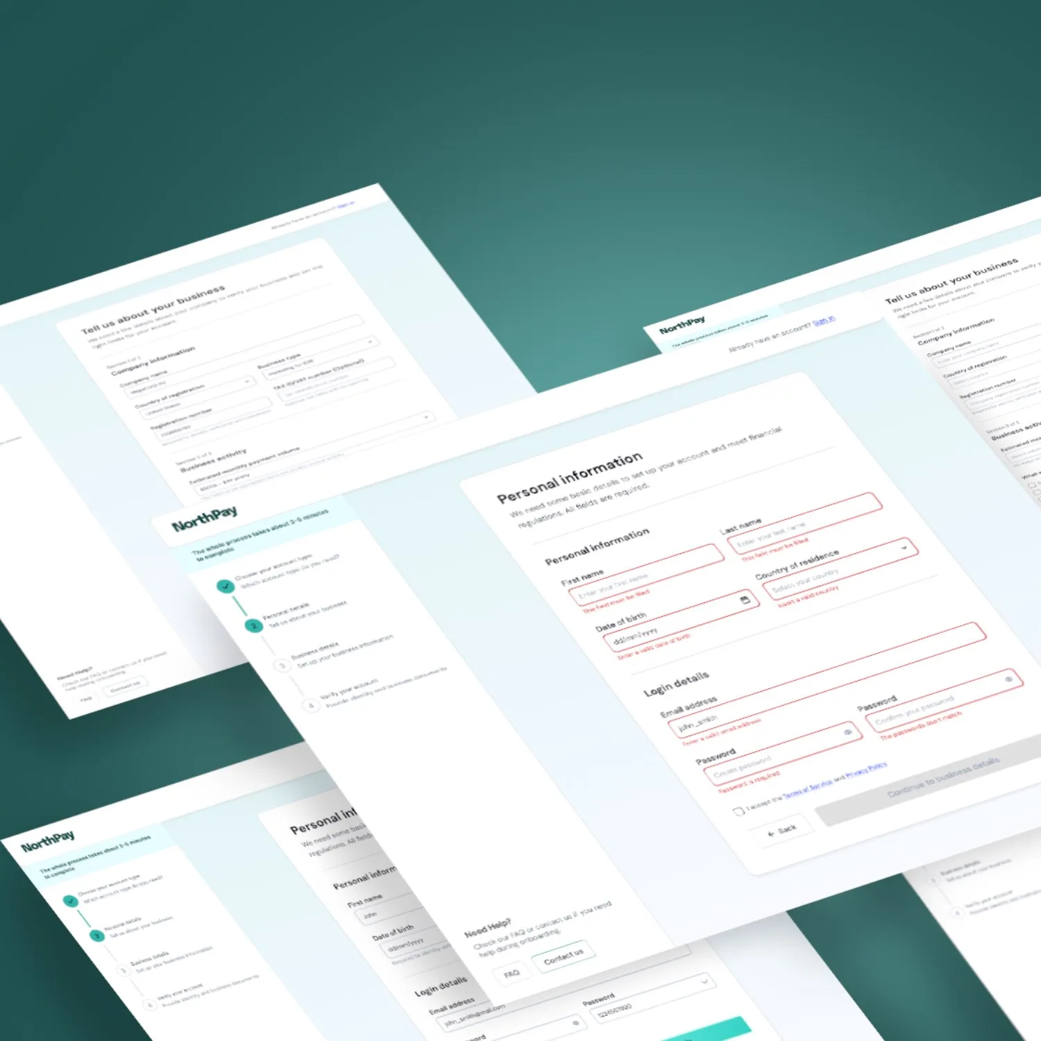
Key interactions & states
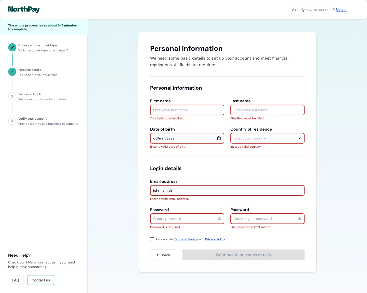
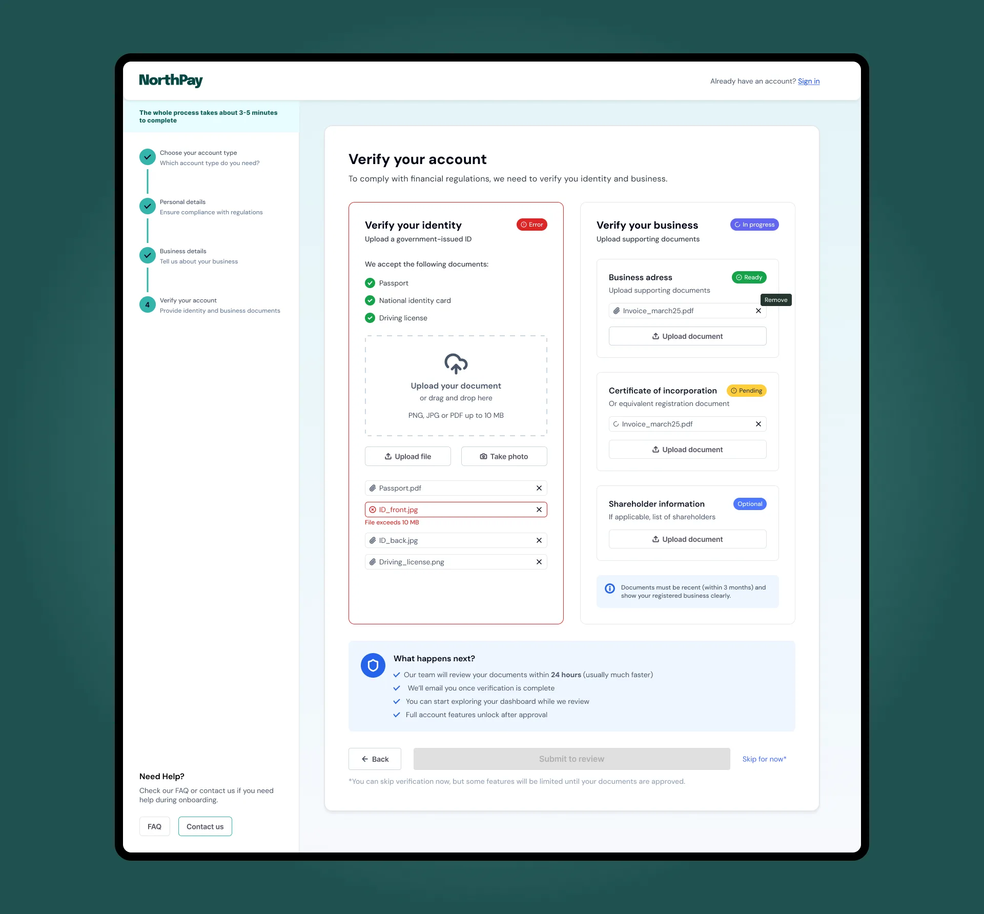
The interactions that matter in this flow are the ones that handle failure: inline field errors, a pending verification state, and a stepper that never hides the remaining steps.
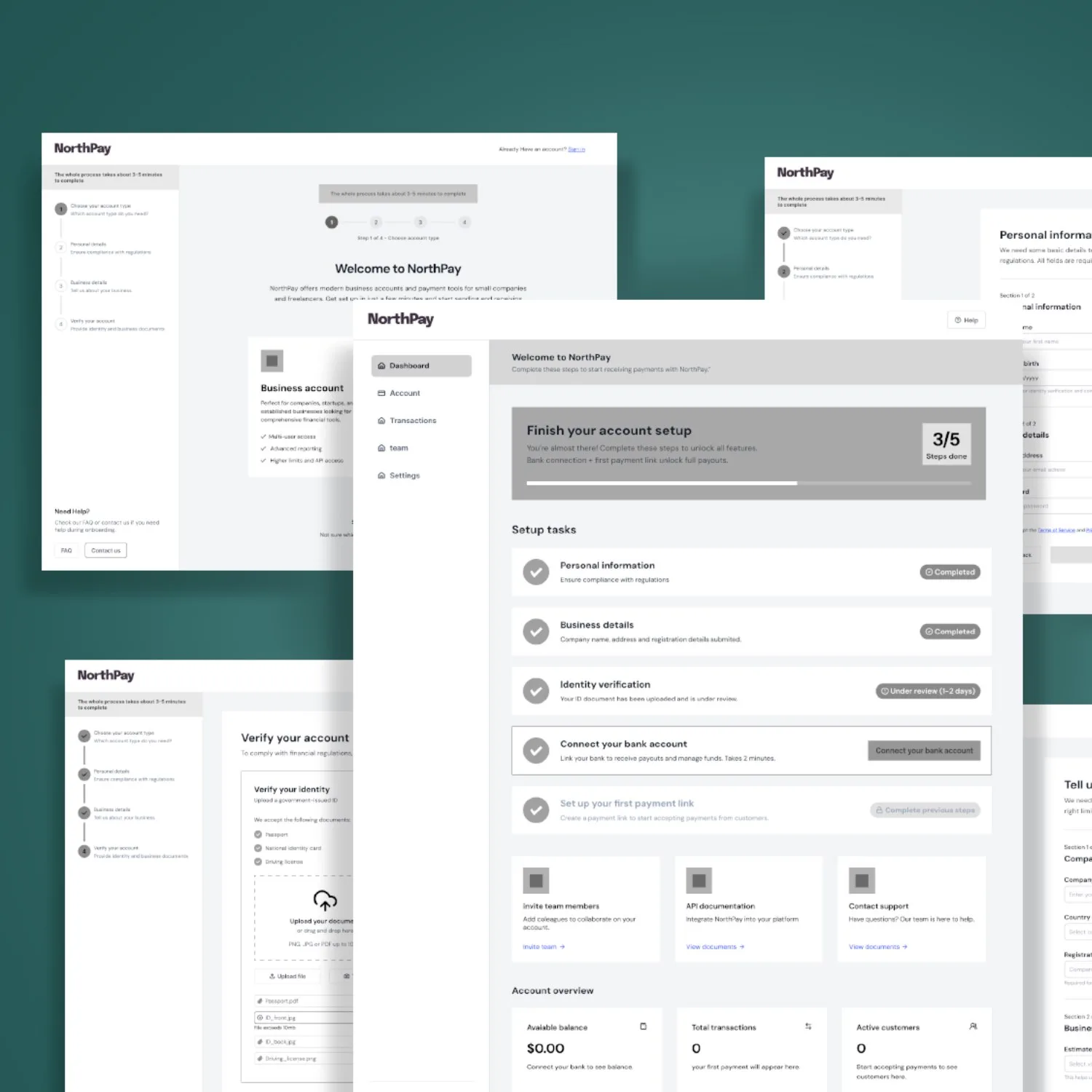
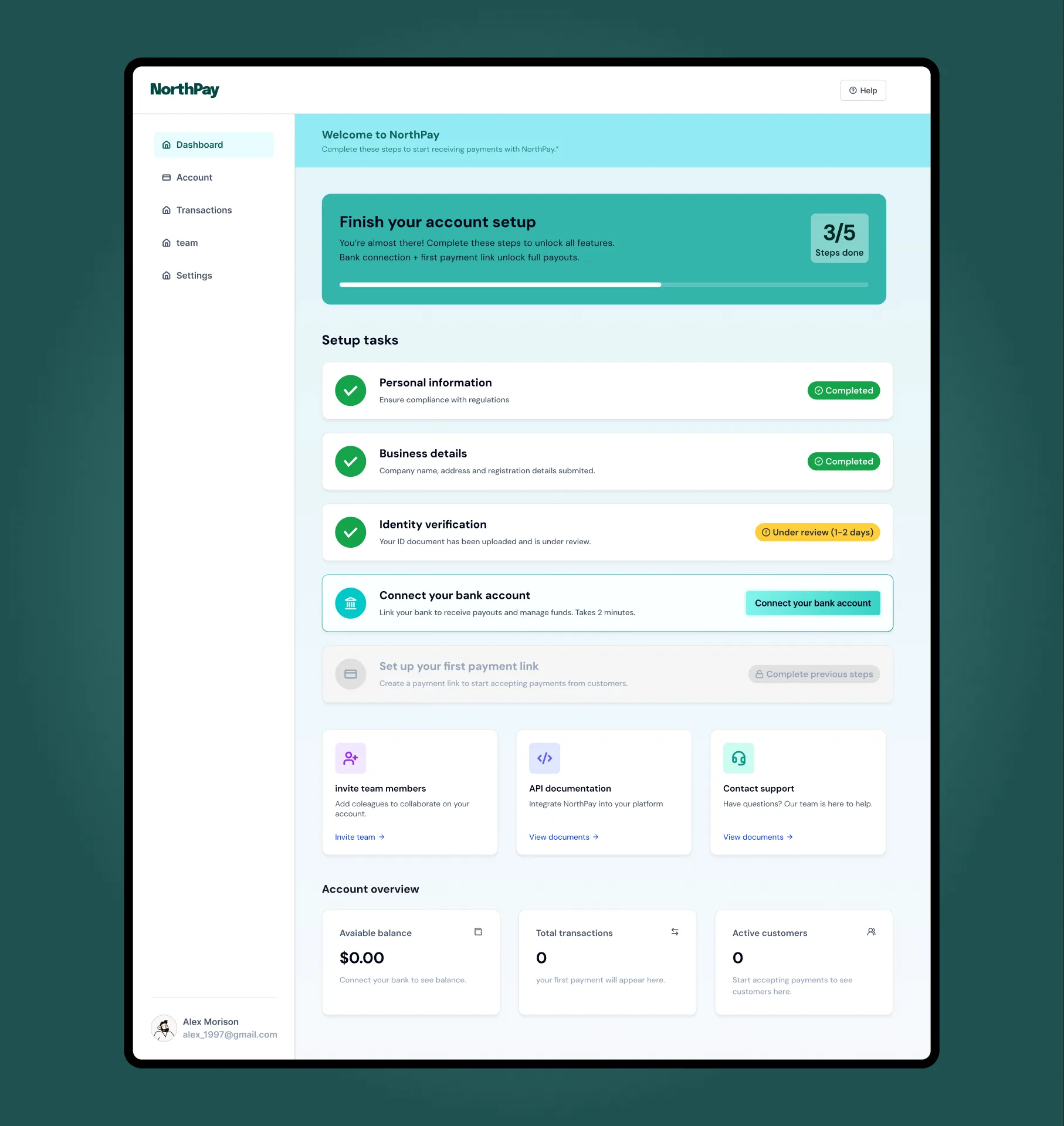
Final screens
Verification confirms the account. Users land on a setup checklist that replaces an empty dashboard with a clear next action, without front-loading every option.
19%
Abandonment rate from forced account creation. Removed from both flows: guest-first entry, account gates moved past first value.
Baymard, 2024
80%
Mobile checkout abandonment addressed by single-question screens and visible 6-step progress
Baymard, 2024
1
Decision per screen. Account type committed before any data collection begins.
Interaction pattern
0
Mid-form type switching. Account choice is locked before the form opens, preventing data loss.
UX decision
Reflections
I didn't design for multi-session completion. The persistent stepper works for a single visit. In real fintech, KYC can span days: manual document review, identity verification queues, pending business registration checks. The flow needs a save-and-resume state I didn't address.
Compliance constraints were simulated. For a concept, I controlled the field sequence entirely. In a real engagement, AML and KYC regulations would dictate which fields appear together and in what order. I'd want to map the legal requirements before finalizing the one-question-per-screen pattern.
The rejected approach deserved a better counterargument. My wireframe of the "account type plus form fields on one screen" was obviously bad by design. An honest validation would build that version well, not as a strawman, and compare usability scores against the one-question approach.
Let's talk
Got a project?
Let's make it work.