Designing the trust layer for home healthcare
Home healthcare has no shortage of demand. What it lacks is the infrastructure for trust: verified identity before anyone enters a home, payment held until the service is confirmed complete, and documented accountability across all three parties in the transaction simultaneously.
+35%
projected checkout conversion
0
payments released without confirmed service
3
trust tokens · chain of custody from booking to payment
Current state · before this project
The on-demand product didn't exist. Ecommerce existed for products, but not for professional services at home.
The problem
Home healthcare's real constraint is trust. Friction is just the visible symptom, and the root cause runs deeper.
A patient opens their front door for a stranger. This isn't a food delivery. This is someone touching your body, drawing your blood, vaccinating your child.
MedMe had a working pharmaceutical ecommerce. What didn't exist was an on-demand product with verified professional identity, payment protection, and accountability covering all three sides of the transaction simultaneously: patient, professional, and clinic.
The original screens stayed with the company. Everything here is a reconstruction from scratch for the portfolio.
Three users, three fears
Three actors are active simultaneously during every appointment. Each has a different set of concerns. Designing for one without the others produces a system that fails at the seams.
Patient
Identity & money
Is this person who they say they are? What if the service doesn't happen? Who holds my payment until it does?
Professional
Equipment & coverage
Will the gear be ready at the clinic? Am I legally covered if something goes wrong at the patient's home?
Clinic
Quality & reputation
Someone represents my brand at a stranger's home. I can't be there. I need documented accountability.
Every design decision in this product is a response to at least one of these fears. The token system and the matching logic each address all three simultaneously: that's where most of the complexity landed.

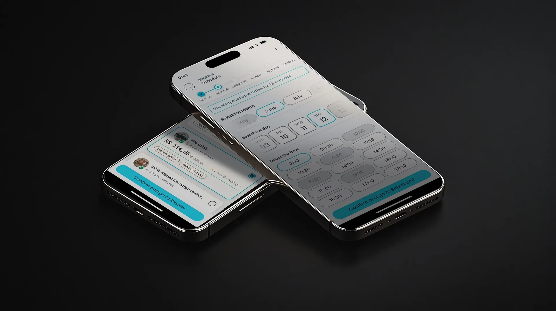
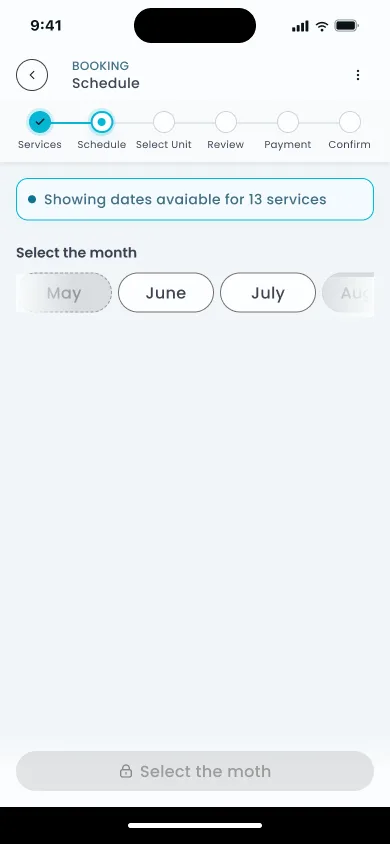
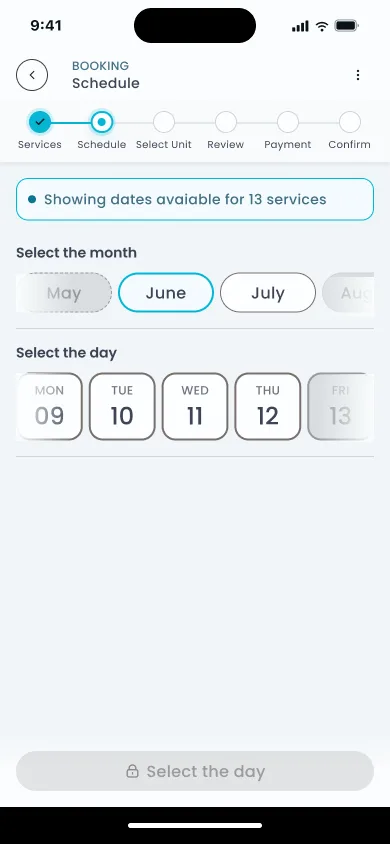
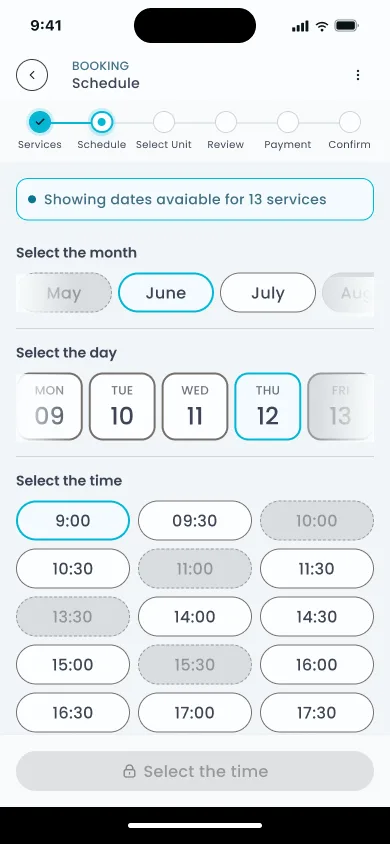
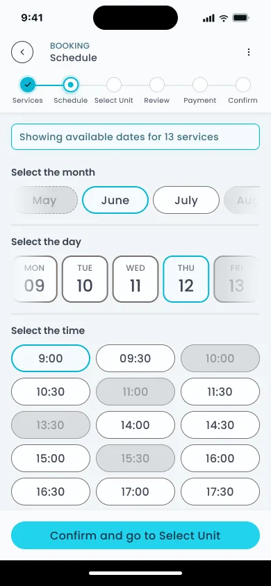
The scheduling decision
Healthcare booking apps typically show every unit before checking availability. You pick one based on distance or name recognition. Then you find a time and discover the slot you wanted is gone. You go back. You pick another unit. You try again.
The information architecture is what's broken here, and it's the structural failure behind most scheduling abandonment in digital health.
27% of patients switched providers specifically because of digital friction (McKinsey, 2025). They didn't abandon the process. They went to a competitor.
MedMe inverts this: the patient selects when, and the system surfaces only what's available at that exact time.
The patient selects when they want the service. The system only shows clinics that have confirmed availability at that specific time. Slots that can't be fulfilled don't exist in the UI. They're never offered.
Before selecting time, the patient chooses visit type: at-home or at-clinic. This single toggle filters everything downstream: which clinics appear, what equipment lists apply, what the professional card shows. At-home visits carry the full token protocol. At-clinic visits use a simplified check-in. The scheduling IA is the same in both cases.
The time selection itself breaks into three sub-steps: month picker, then day, then available slots. Each step narrows the choice space before the next opens. The patient never faces a grid of every open slot. They arrive at a short, filtered list for the specific day they already committed to.
Matching with regulatory competence
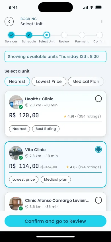
The clinic chooses the professional, not the patient: the only model that holds given how liability actually works in healthcare.
The clinic's certification and reputation are what the patient is trusting when they book. If the clinic assigns the professional, accountability stays in one place. If the patient chooses, accountability fragments and no one owns the outcome.
Standard model
Patient browses a list of professionals. Chooses one. Accountability is diffuse: the platform, the professional, and the clinic all share partial responsibility with no clear chain.
MedMe
Clinic receives the booking. Assigns the professional internally. Patient sees credentials after assignment. The clinic owns the outcome. Liability is clear, trust is verifiable.

When a clinic has no available professional, a pre-approved pool of third-party professionals fills the gap. Same certifications: ANVISA-registered clinics, CRBM-licensed professionals. Same vetting. To the patient, the card looks identical. To the clinic, the pool assignment is flagged in the operational dashboard. The answer is never "unavailable."
After service, all three actors rate each other. The patient rates the professional. The professional rates the patient. The clinic rates the professional's execution. A three-sided rating creates accountability at every point in the chain, including the final review the patient leaves.
One thing this doesn't fully resolve: when a pool professional delivers the service instead of the clinic's own staff, the clinic is rating someone they didn't hire. Whether operators engage with that feedback the same way for pool assignments as for their own team was a question that stayed open.
The time logic
Every slot shown to the patient already includes 60 minutes of lead time built in: the window the professional needs to collect equipment at the clinic before traveling. If that window collapses due to a last-minute booking or a late confirmation, the slot disappears from the picker before it's ever offered. The patient never sees unavailable time.
Showing a slot that can't be executed is worse than showing no slot at all. A confirmed appointment followed by a cancellation destroys trust faster than simply showing the time as unavailable.
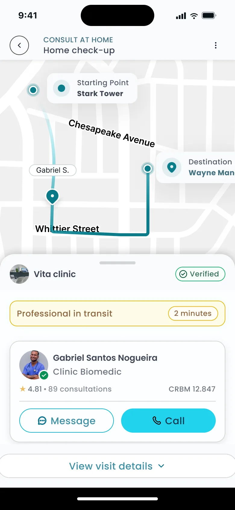
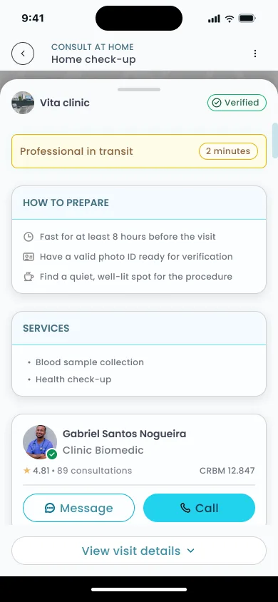
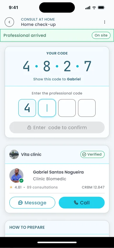
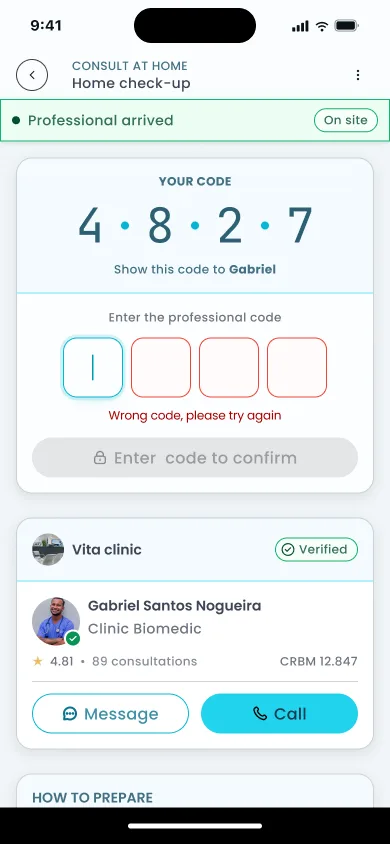
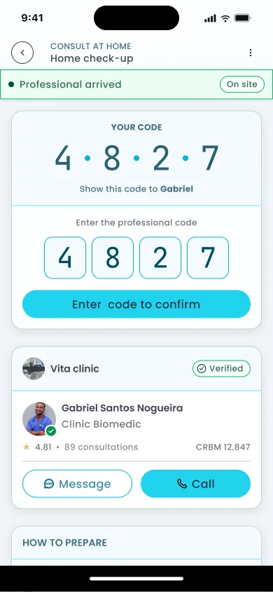
The token system
Three tokens, each solving one problem independently, link into a chain that the patient, professional, and clinic all rely on from booking to payment release.


The bilateral check-in references a pattern that already exists in services patients use daily: the bilateral PIN in Uber, ID verification in Airbnb. The difference is the context: this is a private home and a medical procedure.
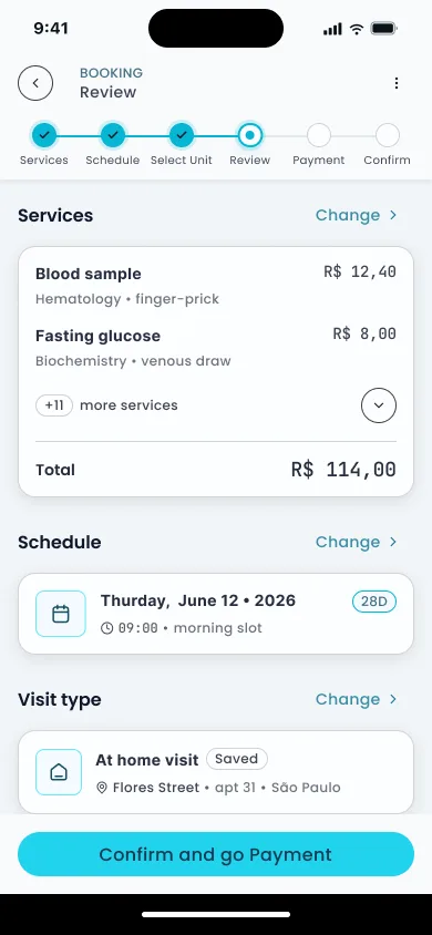
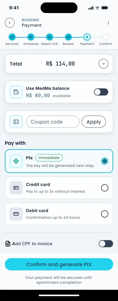
Checkout and payment
Checkout abandonment in healthcare peaks at the point where users realize how many steps remain. A persistent 6-step progress indicator makes the endpoint visible from the first screen. The form breaks into three sub-steps that open sequentially, each unlocking only when the current one is valid. Fewer fields visible at once, no information actually hidden. The reduction to 12-14 fields follows Baymard's benchmark for the field count at which abandonment drops meaningfully.
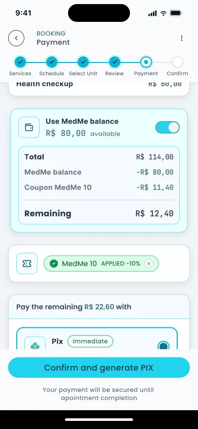
Multi-method payment lets the patient split the total between their MedMe balance and a second method: Pix or card. The coupon input sits on the same screen as payment method selection. Entering a code updates the total immediately, before committing to a method. A visual split bar shows how much each method covers. No mental arithmetic.
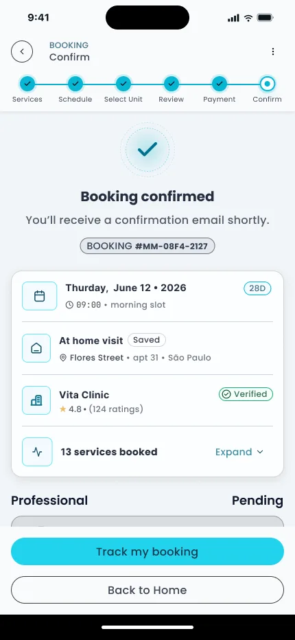
57% of patients say price transparency influences where they seek care (McKinsey, 2025). The escrow note at confirmation shows the patient what they're paying, to whom, and that the money is held until Token 3 is confirmed. Below that, the token protocol is restated in plain language: "Vita Clinic assigns a professional", "Credentials sent for review", "Do digital check-in on the day". Price visibility is a selection criterion before the patient even books.
Outcome
The on-demand product didn't exist before this project. The numbers below are projections grounded in published benchmarks, not post-launch data. The product was built for a company that couldn't share results.
+35%
Projected checkout conversion: form reduction to 12-14 fields + progressive disclosure
Baymard, 2026
60%
Patients reporting friction in digital scheduling, addressed by time-first IA
McKinsey, 2025
74%
Users abandoning due to decision stress, mitigated by 6-step progress indicator
Accenture, 2024
19%
Abandonment from forced account creation, removed from both flows
Baymard, 2024
Three trust patterns from services patients already use, adapted for a medical context:
Hidden cost is the number-one exit factor in ecommerce (McKinsey, 2025). Escrow makes the cost structure transparent: the patient knows exactly what they're paying, to whom, and when it releases.
This was also the project where I worked as the only designer inside a bigger in-house team: daily back-and-forth with the PM on flows and business rules, and just as much with the front-end developers translating specs into the product. That ratio, one designer to several engineers, is what pushed me toward handoffs detailed enough to build from without a follow-up conversation.
Let's talk
Got a project?
Let's make it work.