Collaboard is a conceptual sales CRM interface designed for B2B teams that struggle with noisy tools and unclear next steps. In many CRMs, managers can see a lot of data, but they cannot quickly answer simple questions: where are we stuck, which deals need attention today, and who owns what. Collaboard is built to give that clarity back with a clean layout, generous spacing and navigation that mirrors how sales teams actually work.
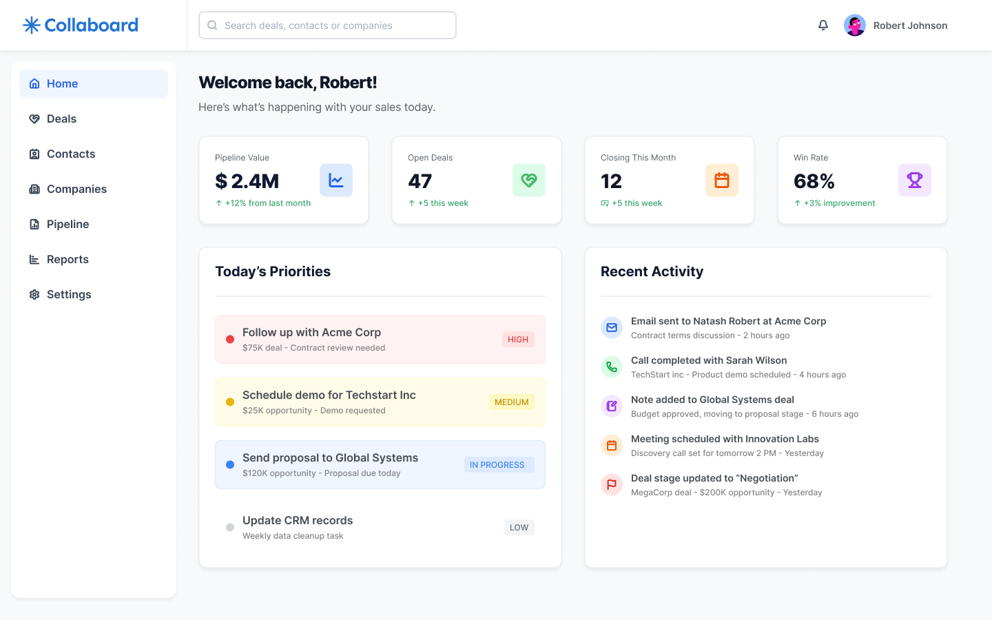
The home view acts as a daily briefing: key KPIs for pipeline value, open deals, deals closing this month and win rate sit above a list of today’s priorities and recent activity. Sales reps understand what matters right now, while managers get an instant snapshot of overall health without digging through reports.
As Senior Product UI/UX Designer, I defined the information architecture and visual system across the app, focusing on reusable cards, consistent iconography and a light, approachable SaaS aesthetic.
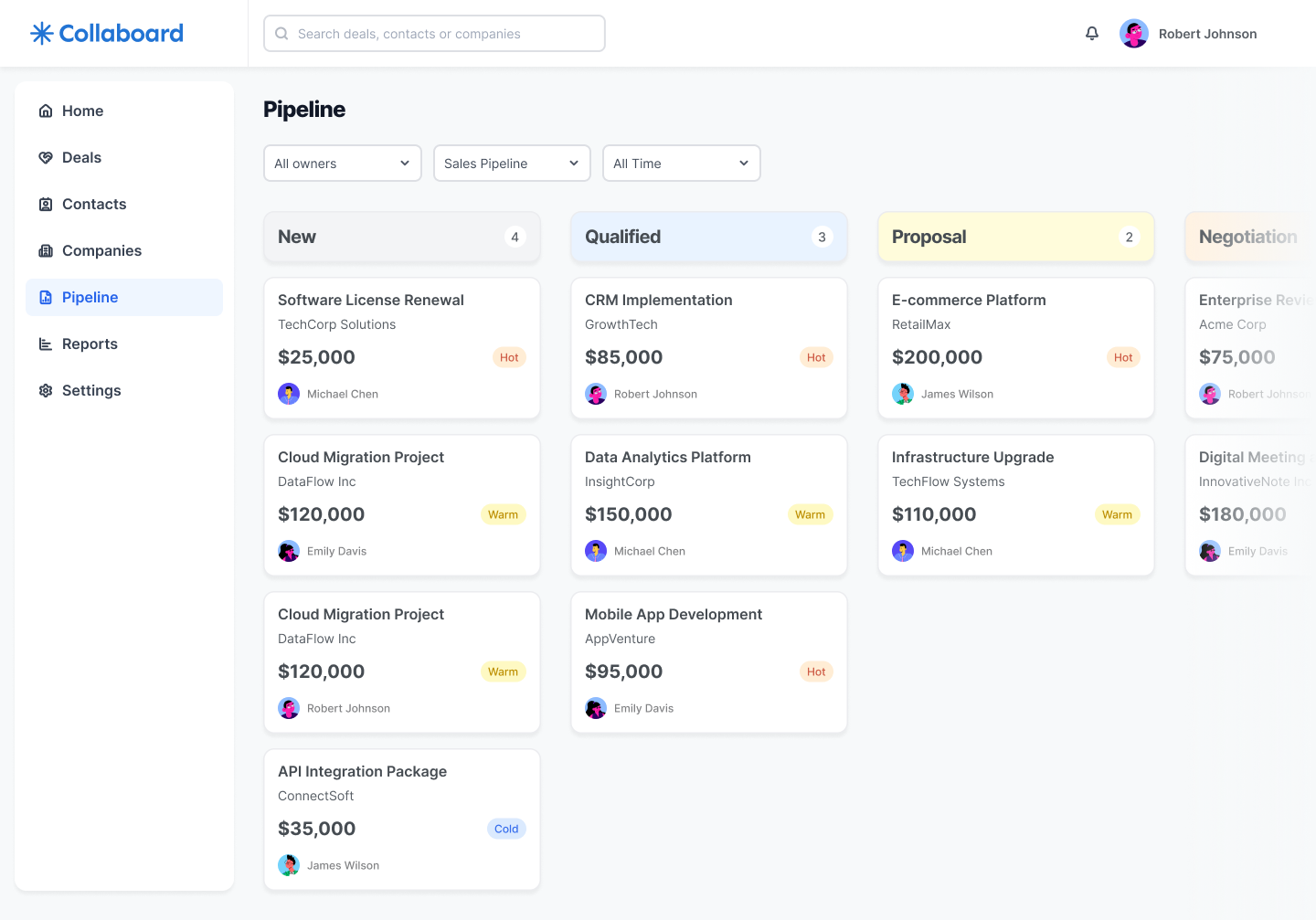
When sales teams cannot see where deals are stuck, the pipeline becomes guesswork. The Pipeline board organizes opportunities into clear columns for each stage, from New to Negotiation. Each card surfaces the essentials at a glance: company, deal name, value, owner and a status chip such as Hot, Warm or Cold. Filters for owner, pipeline type and timeframe sit above the board so managers can move from the global view to one segment in a couple of clicks.
The goal is to make the pipeline feel like a living board instead of a static spreadsheet, helping teams spot bottlenecks early and reassign effort before the quarter is lost.
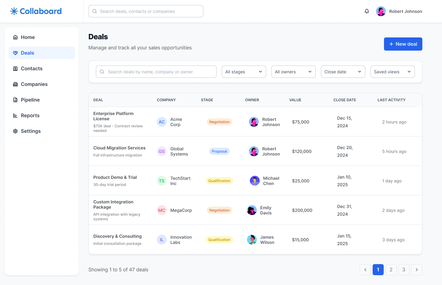
For forecasting and pipeline reviews, sales leaders need a structured view that can be sorted and scanned line by line. The Deals screen complements the board with a table that lists every opportunity alongside stage, owner, value, close date and last activity. The filters at the top allow users to focus on a specific segment, such as deals closing this month or opportunities owned by a single rep.
By using the same tags, avatars and naming conventions as the board, this view keeps cognitive load low while giving leadership the precision they need for revenue projections and one-on-one conversations.
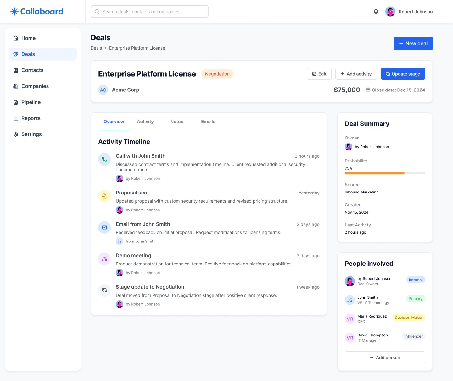
Most CRMs bury crucial context across emails, notes and separate tools. The Deal details view brings everything back into a single, readable layout. At the top, the deal header summarizes company, stage, expected value and close date. Below, an activity timeline groups calls, emails, meetings and notes in chronological order, with clear labels and relative timestamps, so anyone can understand the story of the deal in seconds.
On the right, a summary panel highlights probability, source, key dates and the people involved, including roles like Decision Maker or Influencer. This balance of narrative timeline and structured metadata gives sales teams confidence to pick up the next step without asking for a briefing.
Collaboard demonstrates how I approach B2B sales tools: start from the questions teams need answered every day, then design flows and interfaces that surface those answers with as little friction as possible. From the home briefing to the pipeline board, deals table and detailed timeline, every screen is built to reduce cognitive load, keep focus on revenue and make collaboration between reps and managers simpler.
If you are working on a CRM, pipeline or analytics product with similar challenges, I can help you structure the experience end to end, from information architecture to high-fidelity UI, so your teams see exactly what they need to move deals forward.