BrightFlow is a conceptual SaaS platform that turns scattered customer feedback into clear, actionable insights for product teams. I designed the full visual identity and landing-page experience, including dark-mode UI, dashboard visuals, integrations, pricing, FAQ and final CTA. This case highlights my strengths in SaaS UI/UX, information hierarchy and conversion-focused storytelling for enterprise-grade products.
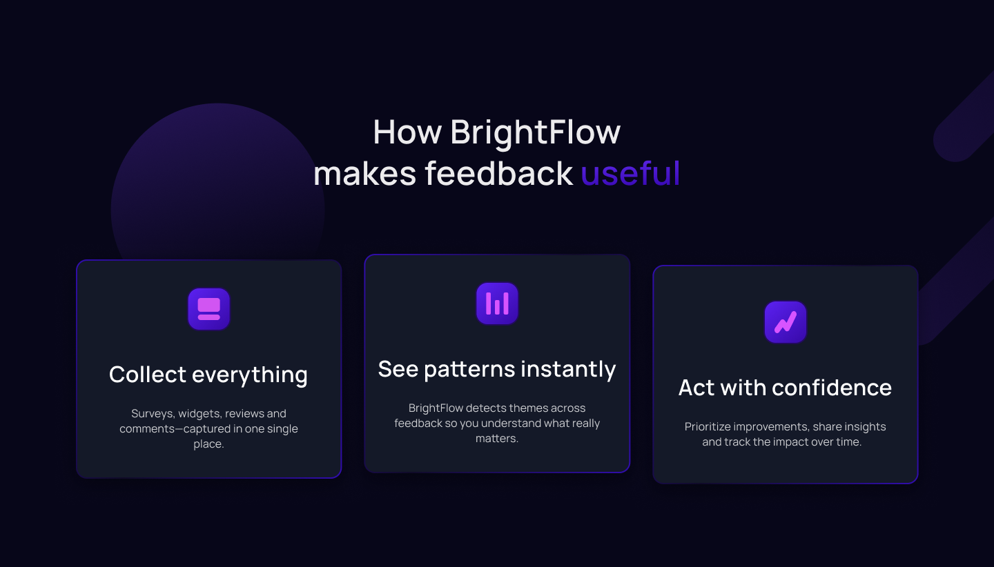
Three-step explanation of how BrightFlow makes feedback useful: collect all signals in one place, surface patterns instantly, and act with confidence. This section bridges marketing language and product behavior for product and UX teams.
Data-visualization blocks show fraud losses, compliance status and performance at scale. These components turn abstract risk into concrete numbers, making the subscription feel cheaper than the cost of inaction.
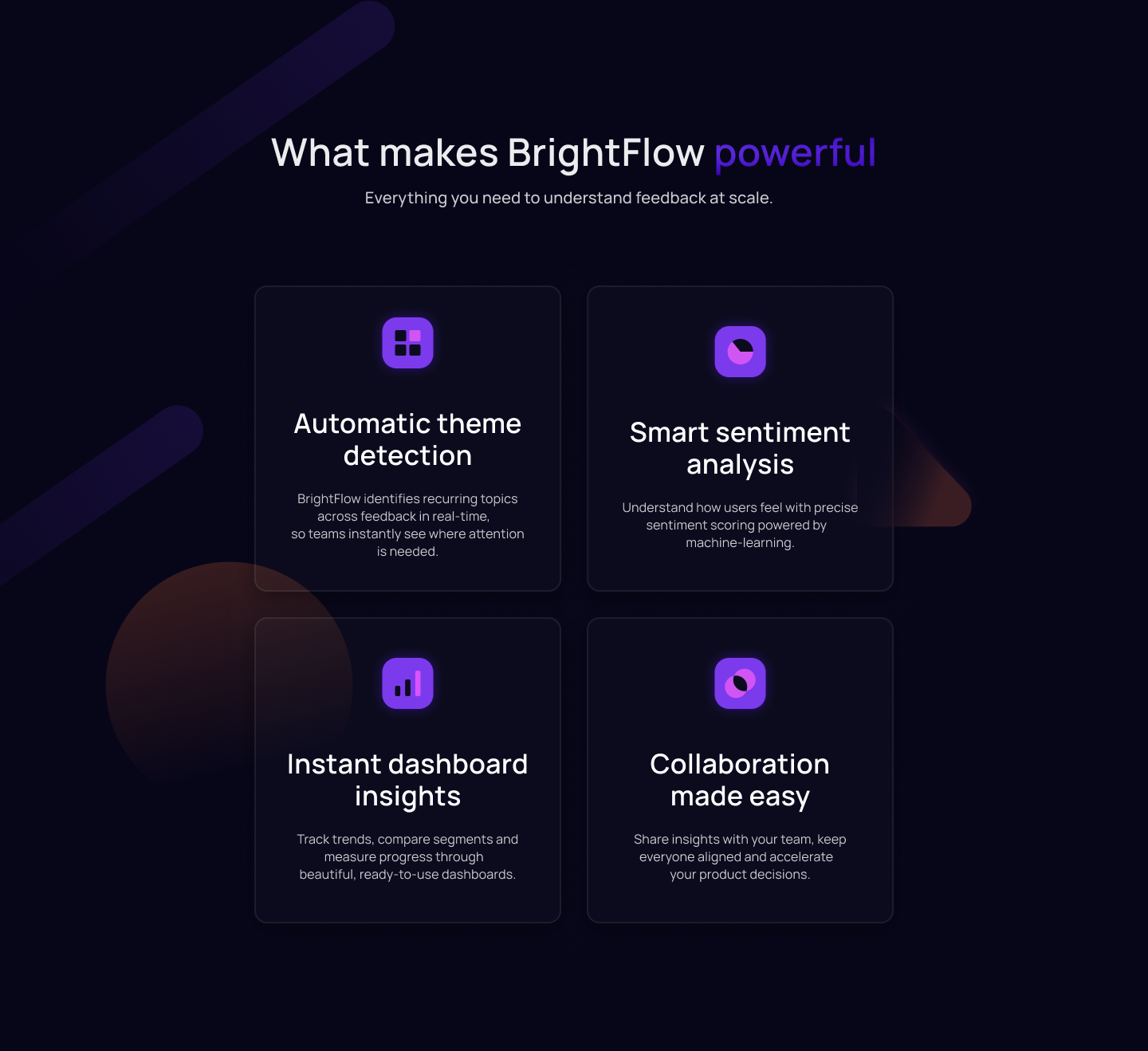
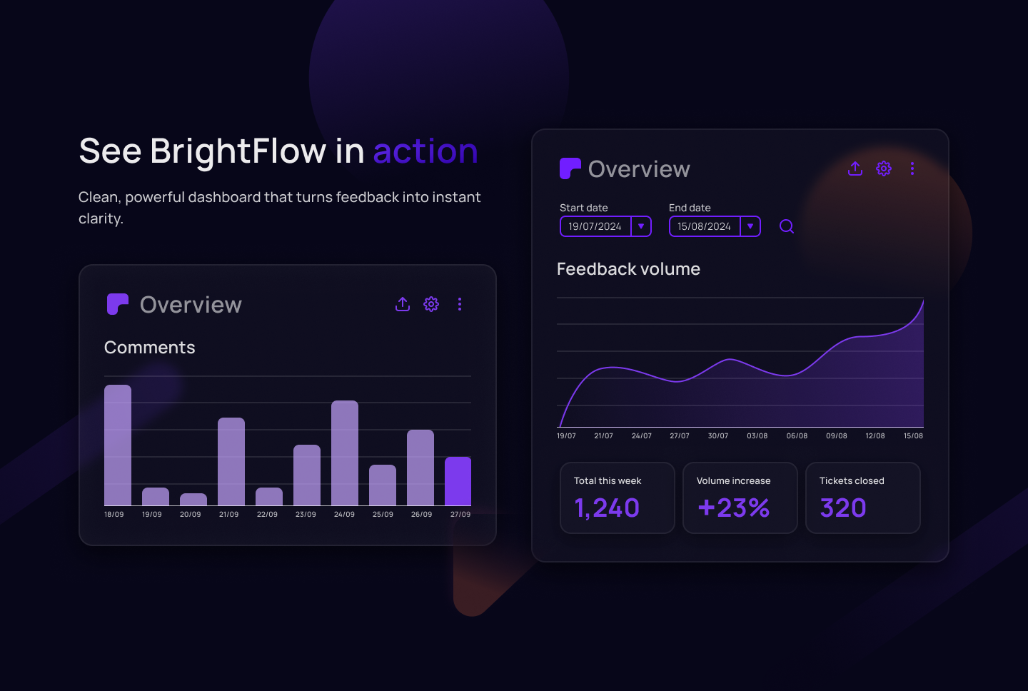
Dashboard concepts that turn raw feedback into charts, metrics and trends. The layouts emphasize hierarchy, contrast and legibility, designed for everyday use by product managers and customer success teams.
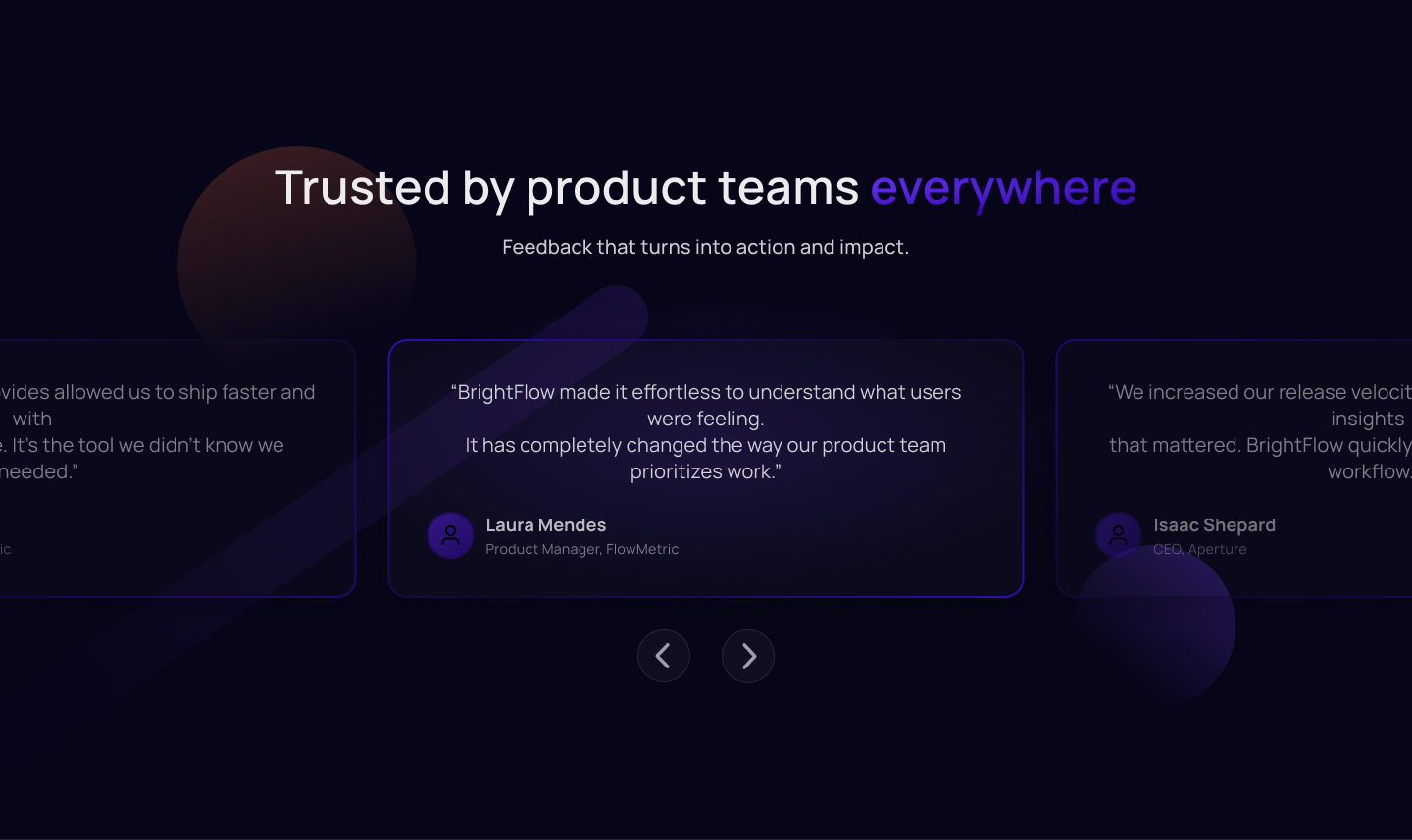
Testimonial carousel bringing real product teams into the story. Quotes focus on speed of insight, clarity on user needs and impact on product decisions, reinforcing credibility before visitors review pricing.
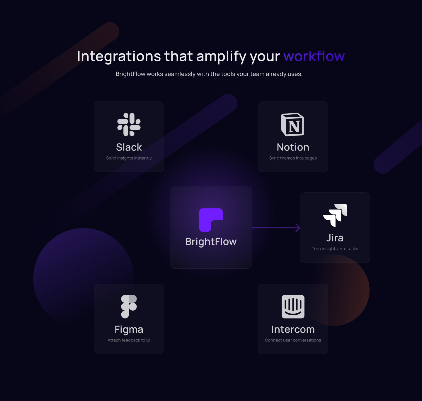
Integration map showing how BrightFlow connects to tools like Slack, Notion, Jira, Figma and Intercom. The visual emphasizes that the platform plugs into existing workflows instead of creating another silo.
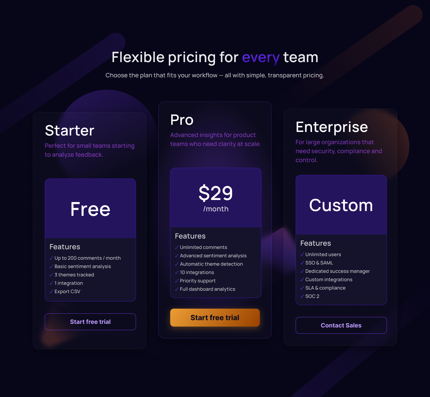
Three-tier pricing structure optimized for clarity: Starter for small teams, Pro as the primary plan, and Enterprise for large organizations. Visual hierarchy leads the eye to the recommended plan while keeping all options transparent.
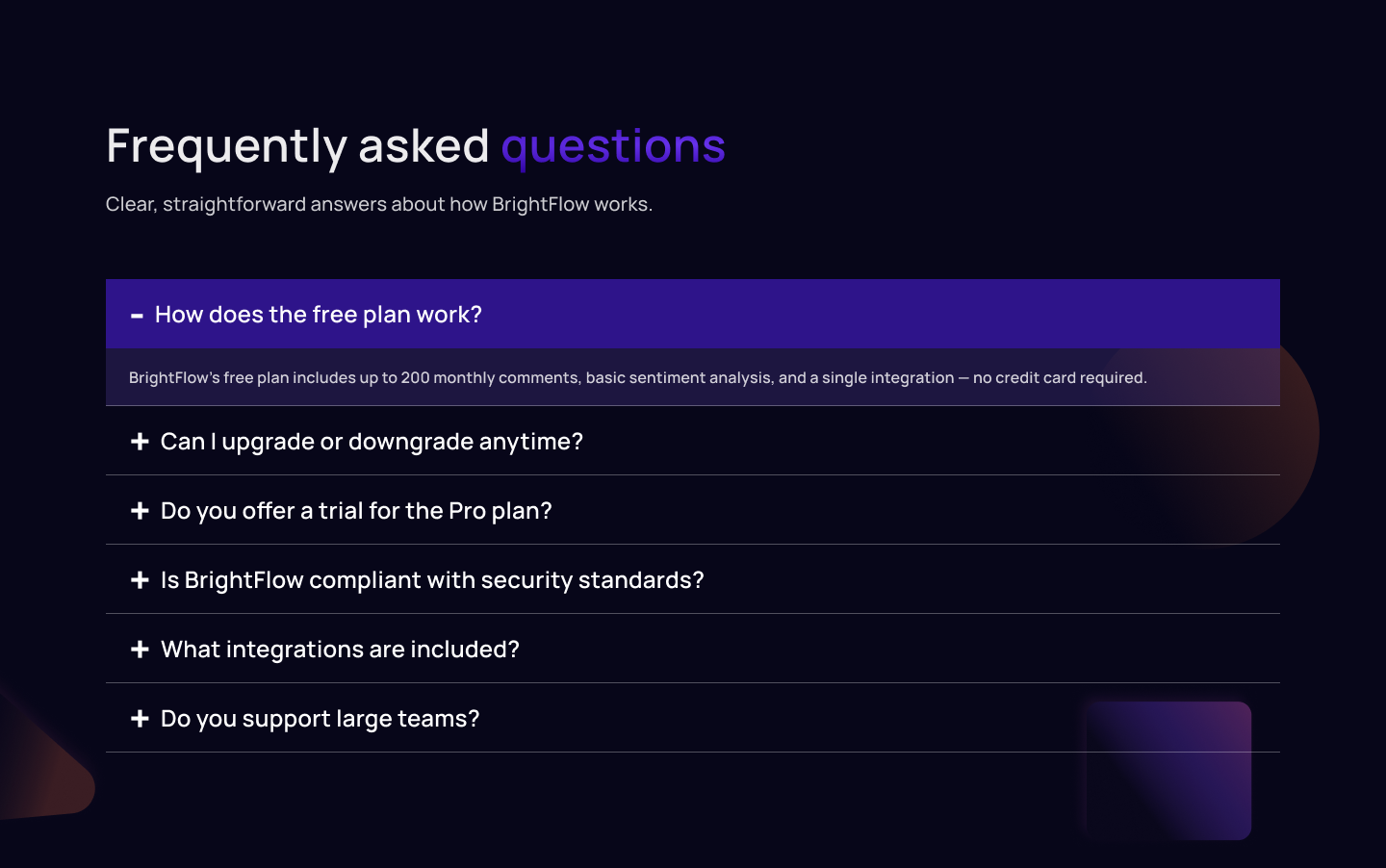
Minimal, Stripe-inspired FAQ layout with clear questions, soft separators, and straightforward answers for maximum readability.
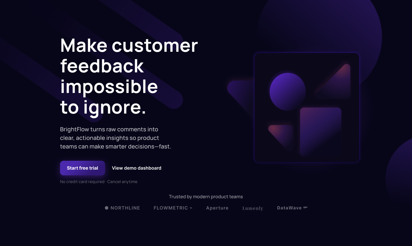
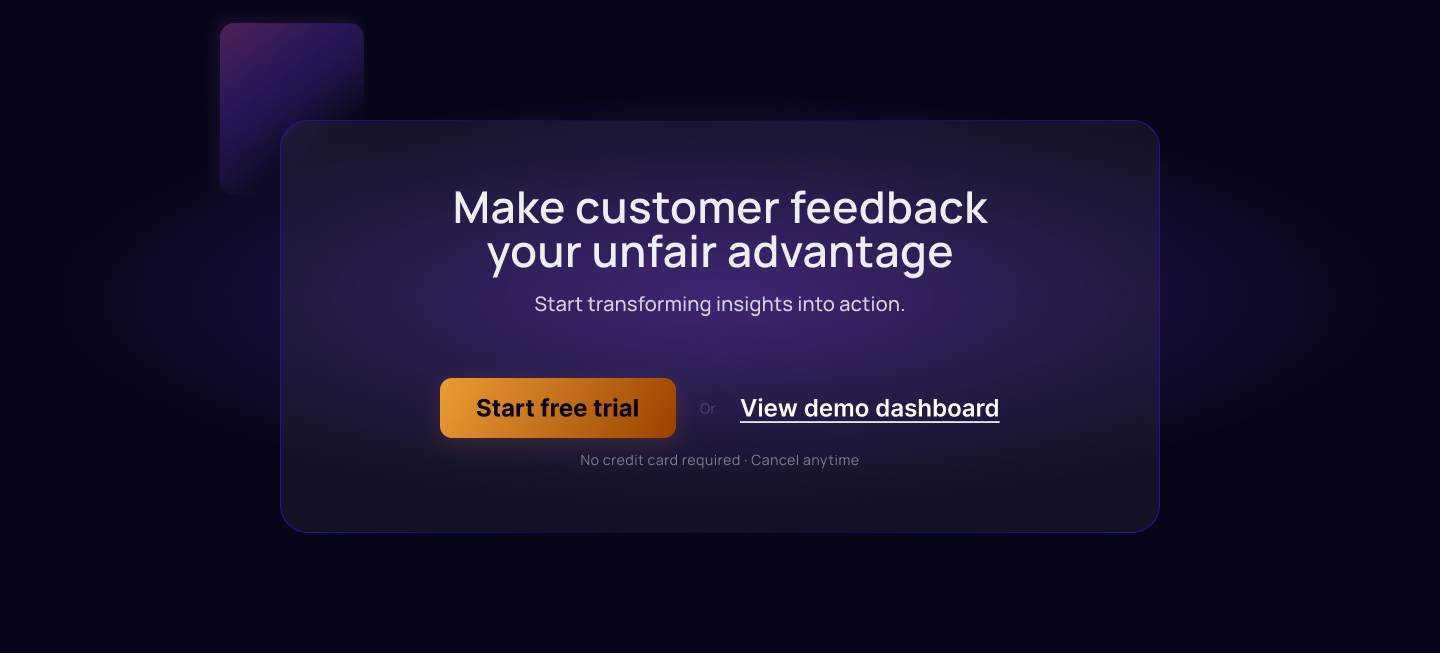
Final call-to-action panel and footer. The CTA restates the value proposition and offers clear next steps—start a free trial or view the demo dashboard—while the footer organizes key navigation and brand elements in a clean, consistent layout.
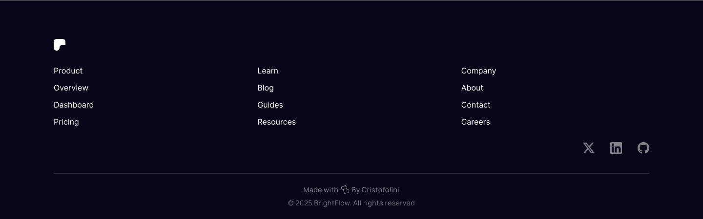
A clean, structured footer with brand elements, links, and social icons. Dark styling keeps the page consistent and professional.